Spring Design Partners Designed Sauce Labels to Mimic Italian Tones
Ady Floyd — May 31, 2015 — Art & Design
References: springdesignpartners & thedieline
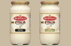
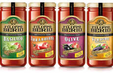
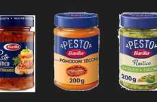
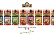
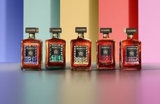
Bertolli's newly designed sauce labels were created by Spring Design Partner Inc. to reflect the Italian roots where the sauce originated. In order to meet the desires of health-conscious and food-loving consumers, the labels are simple and endearing.
Italy is famous for pasta so it is vital for the Bertolli sauce company to project a beautiful Italian presence among other sauce varieties. The Italian designed sauce labels tell the full story of Bertolli in an elegant, pastel color-infused packing. Each color represents the fresh ingredient like green artichokes, brown mushrooms and purple balsamic vinegar.
The personalized typography used on the labels is cohesive throughout the brands different sauce flavors. The ultimate goal for the labels was to make them each look like an old Italian style movie poster.
Trend Themes
-
Italian-inspired Packaging Design — Capitalizing on the Italian origins, sauce companies can create labels that reflect the essence of Italy, using pastel colors and cohesive typography.
-
Health-conscious Labeling — Health-conscious consumers gravitate towards simple and endearing labels, encouraging sauce companies to focus on minimalist designs that showcase fresh ingredients.
-
Personalized Typography — Using cohesive typography across different sauce flavors can create a distinctive brand identity, reminiscent of old Italian movie posters.
Industry Implications
-
Food & Beverage Packaging — Companies in the food and beverage packaging industry can explore Italian-inspired design trends to create eye-catching labels for sauces and other products.
-
Gourmet Food — The gourmet food industry can leverage Italian-inspired packaging to enhance the overall experience of their products and cater to food-loving consumers.
-
Health Food — Health food companies can adopt simple and endearing labeling techniques to attract health-conscious consumers and highlight the freshness of their ingredients.
2.2
Score
Popularity
Activity
Freshness
