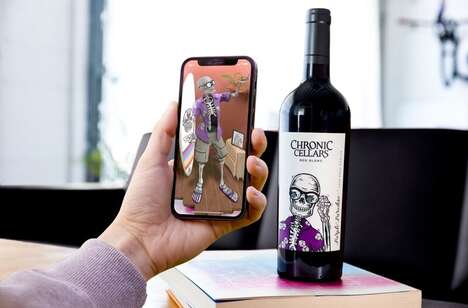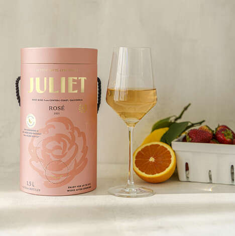
You may not be able to distinguish what Cuboid sells based on its packaging's initial impressions, but I'm sure you'll gravitate towards the colorful boxes with the quirky font and 8-bit characters anyways. That's because the Rutherford Wine Company, the makers of Cuboid, wanted to produce a Cabernet Sauvignon that would directly appeal to a more youthful crowd. I think most people can safely say that RWC's mission was a success.
The packaging for Cuboid features vintage-looking colors as well as a typeface reminiscent of the video game Q*bert. It is made from eco-friendly materials and sports an 8-bit graphic of a person enjoying the drink in order to add that extra appeal to make buyers choose this quirky wine instead of Rutherford Wine Company's competitors.
Why This Trend Is Growing
- Retro Packaging
- Exploring vintage-looking colors and retro fonts in packaging designs presents disruptive innovation opportunities for companies to appeal to a more youthful crowd.
- Quirky Typeface
- Utilizing unusual fonts, like the 8-bit characters seen in Cuboid's packaging, presents disruptive innovation opportunities for companies to create unique and memorable branding.
- Eco-friendly Materials
- Embracing sustainable and eco-friendly materials in packaging designs presents disruptive innovation opportunities for companies to cater to environmentally conscious consumers.
Industries Being Reshaped
- Wine & Spirits
- Brands in the wine and spirits industry can explore retro packaging and quirky typeface designs to attract younger consumers and differentiate themselves from competitors.
- Graphic Design
- Graphic designers can leverage the trend of retro packaging and quirky typeface to create unique and eye-catching designs that resonate with consumers.
- Eco-friendly Products
- Companies producing eco-friendly products can adopt the use of eco-friendly materials in packaging designs to align with their sustainability values and attract environmentally conscious consumers.