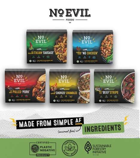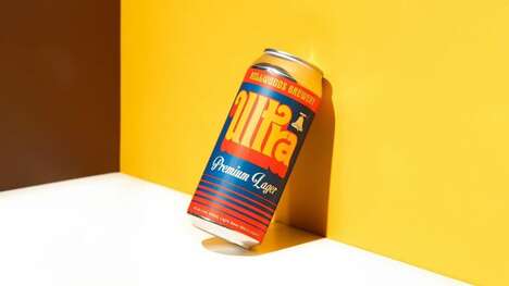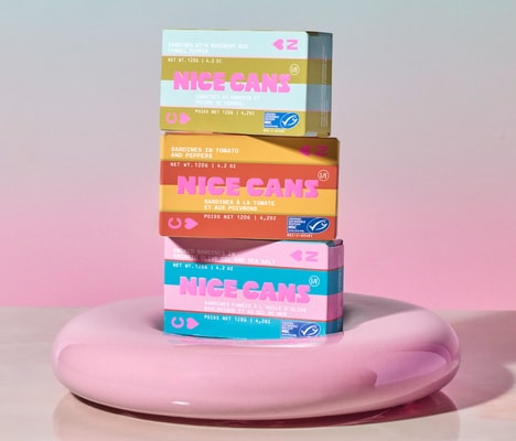
When it comes to canned goods, there's often an affordable aesthetic associated with the design, yet that's not the case at all with Black Bear. A series of canned and packaged foods, the design is as stylish as it can be. From artistic illustrations and modern typography to an overall simple color palette with just a single splash of color, it's hard not to be instantly attracted to the brand.
Created by Rodrigo Chiaparini and Mari Silva of Chiapa Design, the Black Bear packaging is meant to represent the link between the salmon and the bear food chain. The name Black Bear itself is meant to convey the idea of strength and modernity, which is mimicked throughout the striking brand identity.
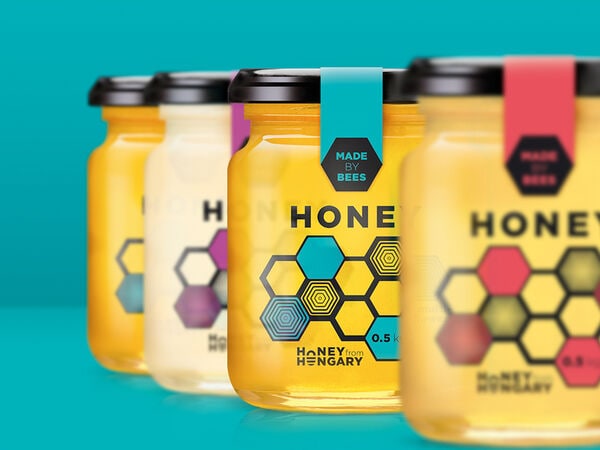
What Makes This Trend Stand Out
- Stylish Packaging
- Opportunity for innovation in designing stylish packaging for affordable goods.
- Artistic Illustrations
- Opportunity for innovation in using artistic illustrations to make brand identity more visually appealing.
- Minimalist Design
- Opportunity for innovation in using minimalism in packaging design for an elevated look.
Sectors Adopting This
- Canned Goods Industry
- Opportunity for disruption in the canned goods market by introducing stylish packaging designs.
- Food Packaging Industry
- Opportunity for innovation within the food packaging industry by incorporating more creativity in design.
- Art and Design Industry
- Opportunity to merge the art and design industry with packaging design to create unique and appealing brand identities.