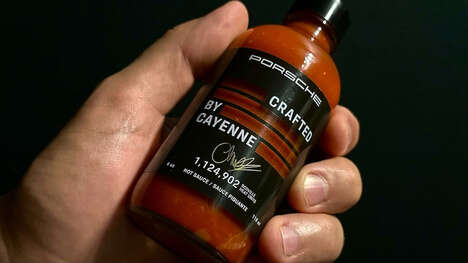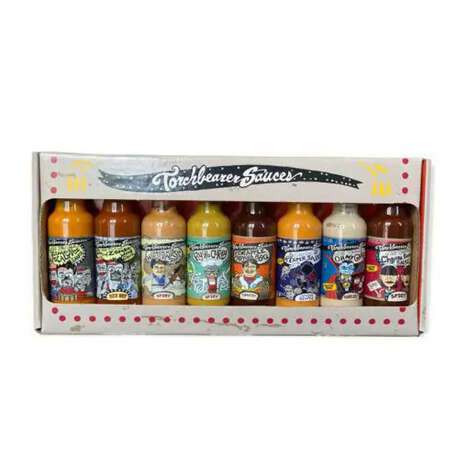
The heat of the contents of Angry Man Salsa packaging is complemented with a clever marketing method. The spiciness of this nachos and burritos sauce can be reasonably described as fiery. What else is fiery? The temper of a displeased man.
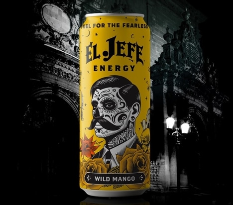
The Foundry Co. team working on the brand identity of this product chose to create a mascot for it to infuse the idea of the dip with personality. They drew up a very dissatisfied-looking cartoon character with his hands on his hips and a very grumpy face.
To accompany this enraged gentlemen is a color scheme of bright red that surrounds the label. Angry Man Salsa packaging also features an old West typeface that's as bold as the hot tomato spread tastes.
Key Themes Behind This Trend
- Fiery Branding
- Exploring anger and intense emotions in branding to create a memorable and impactful identity.
- Personified Packaging
- Using mascots and characters to give products a unique personality and enhance brand recognition.
- Bold Color Schemes
- Incorporating vibrant and attention-grabbing colors in packaging designs to make a strong visual impact.
Where This Applies
- Food Packaging
- Leveraging rage-based branding schemes in the food packaging industry to differentiate products and attract consumers.
- Marketing and Advertising
- Utilizing personified packaging strategies to enhance brand storytelling and engage customers through emotional connections.
- Graphic Design
- Creating bold and visually striking packaging designs using fiery color schemes to capture consumer attention and stand out on shelves.