


McDonalds Draws a Blank
Every designer knows that a good use of white space can be very effective. Keeping a certain proportion of an advertisement without clutter is vital, but just how much is the right amount?
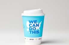
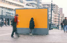
McDonalds took the white space concept really far in a recent ad in a print publication. The double page spread features nothing on either white page except for a few coffee stains and a tiny logo in the bottom right corner of the right page that reads, "Extra Large Coffe 16 Sek" and the McDonald's logo.
Effective? Very. You look. It gets your attention. It evokes curiosity. Adrants writes about it. We write about it. Does it make me want to bypass Starbucks for a cup of joe at McDs? No way. But hey, it's all about branding, spreading a message, and getting people to blab about the brand. In that sense, the ad is exceptional.
Trend Themes
1. Minimalist Advertising - Exploring the use of white space and minimal elements in advertisements to create impact and evoke curiosity.
2. Attention-grabbing Ads - Utilizing unconventional and minimal ad designs to capture viewer's attention and stand out from the crowd.
3. Branding Through Curiosity - Using mysterious and minimalist ad approaches to generate curiosity and spark conversations about the brand.
Industry Implications
1. Advertising and Marketing - Opportunity for ad agencies and marketers to experiment with minimalist ad designs and leverage curiosity-driven branding techniques.
2. Print Publications - Potential for print publications to offer innovative ad spaces that embrace the use of white space and minimalist designs.
3. Coffee and Fast Food - Disruptive potential for coffee and fast food chains to rethink their advertising strategies and find unique ways of capturing consumer attention through minimalistic approaches.
5.9
Score
Popularity
Activity
Freshness