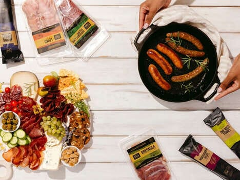
It is possible to tell the story of a brand through packaging, and this was precisely the challenge behind the new Vermont Smoke & Cure identity. Enlisting the help of Sterling Brands, the business communicated its processes and values through charming agricultural illustrations.
Each of the flavors of the healthy, hormone-free meat sticks is represented by a different, bright color, taking the silhouette shapes of pigs, cattle, farmers and cyclists on the rolling farm landscape. Texture was applied to the simplified imagery to take the semblance of wood grain, presenting a rustic and homey underlying layer to the Vermont Smoke & Cure look.
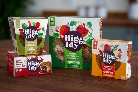
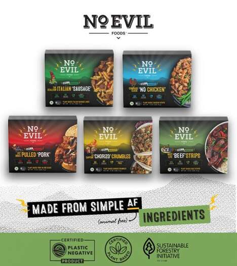
Designing brand identity requires a careful balance between communicating the business's products and mission, and appealing to consumers' contemporary aesthetic tastes. This packaging accomplishes both with great success.
Key Themes Behind This Trend
- Story-telling Packaging
- Opportunity for brands to communicate their processes and values through visually appealing packaging designs.
- Charming Illustrations
- Use of charming agricultural illustrations on packaging designs to create a unique and captivating brand identity.
- Texture and Color Representations
- Incorporating textured imagery and bright colors on packaging to enhance the visual appeal and differentiate product flavors.
Where This Applies
- Food Packaging
- Opportunities for food brands to use innovative packaging designs to convey their brand story and values.
- Meat Products
- Opportunities for meat product companies to differentiate their offerings through visually appealing and story-based packaging designs.
- Graphic Design
- Opportunities for graphic design firms to create unique and captivating packaging designs for various industries.