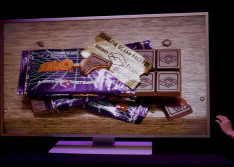
Hans Rosling’s ‘The Joy of Stats’ is a new television documentary scheduled to air on BBC. It explores data gathering and statistical analysis and uses holographic inforgraphics to help explain the concepts.
Professor Hans Rosling uses numbers to ‘tell the story of the world’ in four minutes. Using statistical data, he plots life expectancy in relation to income for every country since the year 1810 and demonstrates that what we expect isn’t always what we get. Rosling's holographic infographics get us to see that the joy of stats is in revealing what we might not otherwise see.
Key Themes Behind This Trend
- Holographic Infographics
- Opportunity for businesses to create engaging and visually appealing data visualization using holographic technology.
- Data Gathering
- Potential for innovative data collection methods and tools to improve accuracy and efficiency.
- Statistical Analysis
- Demand for advanced statistical analysis techniques and software to gain insights from data.
Where This Applies
- Television
- TV industry can explore using holographic infographics to enhance data-driven storytelling in documentaries or news programs.
- Technology
- Opportunity for tech companies to develop holographic visualization tools and software for data analysis.
- Education
- Innovative ways to incorporate holographic infographics in educational materials to make statistics more engaging and easily understandable.