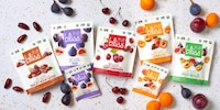
For some graphic designers and branding experts, subtlety is the way to go, but other brands like TASTEit prefer to use a much more blunt approach. What could be more direct than using a name that tells consumers exactly what a company's intentions are?
Such is the case with the TASTEit identity from Italy, which is a great way to stand out from the competition and do something a bit different. The brand name itself is done in bold black letters against a white background in order to stand out. Colorblocking is also used on the base of the label to add that touch of brightness. Overall the main selling point for this food is the name of the brand itself: TASTEit.
Why This Trend Is Growing
- Blunt Branding
- Opportunity to disrupt traditional branding strategies by using direct and bold messaging.
- Standout Packaging
- Opportunity to create packaging that is visually striking and attention-grabbing to differentiate from competitors.
- Colorblocking
- Opportunity to utilize colorblocking techniques in packaging design to add vibrancy and visual appeal.
Industries Being Reshaped
- Food and Beverage
- Opportunity for food and beverage brands to explore bold and direct branding strategies to attract consumers.
- Graphic Design
- Opportunity for graphic designers to experiment with unconventional packaging designs that stand out on store shelves.
- Branding and Marketing
- Opportunity for branding and marketing professionals to explore new approaches that prioritize direct messaging and visual impact.