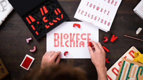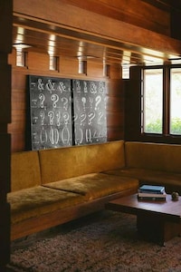

The Synoptic Office 'Alphabet Topography' by Caspar Lam and Yujune Park from Yale University physically depicts a love of the English language and thoughtfully makes each letter stand out as much as it is used. For example, constants such as "R" and "T" can be seen jutting out further beyond alternate letters since they are used more in English.
The design is physical typography, and each letter is designated a six by six square. The entire project shows the rhythmic flow of the English language and makes it visible to the eyes. Audiences can follow along the alphabet on the Synoptic Office Alphabet Topography model and almost feel the weight of each letter in the English language.
What Makes This Trend Stand Out
- Physical Typography
- The use of physical materials to create typography offers opportunities for creative and interactive designs.
- Data Visualization
- Utilizing visual techniques to represent data, such as the representation of letter frequency, can provide new insights and understanding.
- Language Analysis
- Analyzing the patterns and usage of a language can lead to innovative approaches in visual communication.
Sectors Adopting This
- Graphic Design
- Graphic design firms can explore physical typography as a way to create unique and engaging visuals for their clients.
- Data Analytics
- Data analytics companies can leverage data visualization techniques to help individuals and organizations make sense of complex information.
- Education
- Educational institutions can incorporate language analysis concepts into their curriculum to enhance students' understanding of language structure and usage.