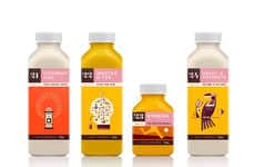
MANA Juice Uses Simple Outlines of Fruits on Its Labels
References: primprim.lt & thedieline
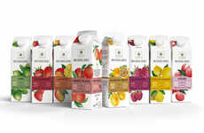
MANA is a juice company that worked with Prim Prim design studio to create a packaging design made up of simple outlines. The simple outlines of fruit and vegetables are visually pleasing and project a simply pure image to consumers.
The cold-pressed Lithuanian juice company caters to those who are active and healthy, but don't have the time to make their own fresh-squeezed juices. The idea behind the packaging was to remain simple and not to overwhelm consumers with busy labels or overbearing logos. Cold-pressed juice is a pure form of squeezed vegetables and fruits, so the elegant labels are a perfect fit.
The colors used for the logos are the same as the colors of juices. The juice is visible through the clear glass bottles and the white label adorning the matching colored lettering and small images gives the bottles an extremely fresh look.
Trend Themes
-
Minimalist Packaging — Opportunities exist for businesses to simplify their product labels and focus on a clean, uncluttered design approach to appeal to consumers.
-
Visual Branding — More brands can create logos and packaging designs that visually connect with their products, using colors and imagery that reflect the natural qualities of the ingredients and create a fresh, healthful look for their products.
-
Transparent Packaging — As more brands switch to sustainable and eco-friendly packaging, there is an opportunity to showcase the product by using clear glass and other materials to let consumers see the natural colors and textures of the juices inside.
Industry Implications
-
Health & Wellness Industry — The trend towards simple, healthful and visually elegant packaging presents disruptive innovation opportunities for businesses across the health & wellness industry, from supplements to food products.
-
Beverage Industry — New juice and beverage companies can disrupt the market by focusing on simple, fresh ingredients and using minimalist packaging and visual branding to stand out from more established brands.
-
Sustainability Industry — Companies in the sustainability industry can help businesses create eco-friendly packaging materials that minimize their environmental impact while also creating packaging designs that showcase the natural beauty of the products they contain.
3.5
Score
Popularity
Activity
Freshness
