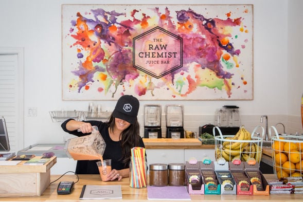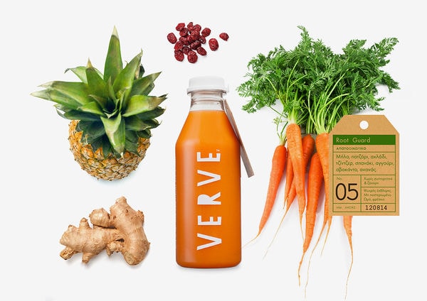
Lauren Nichole Foote has designed a new packaging concept for RAW, a Vancouver-based health bar featuring locally-sourced organic beverages.
The company features three pre-made juices: The Beach, The Cove, The Grind and The Chief. The titles come from different beaches or hiking spots throughout the city. Each beverage is packed with nutrients that we tend to lose throughout the day. If you prefer a smoothie to a juice, you're in luck, as the beverages are available in both forms. Customers also have the option of creating their own drink.
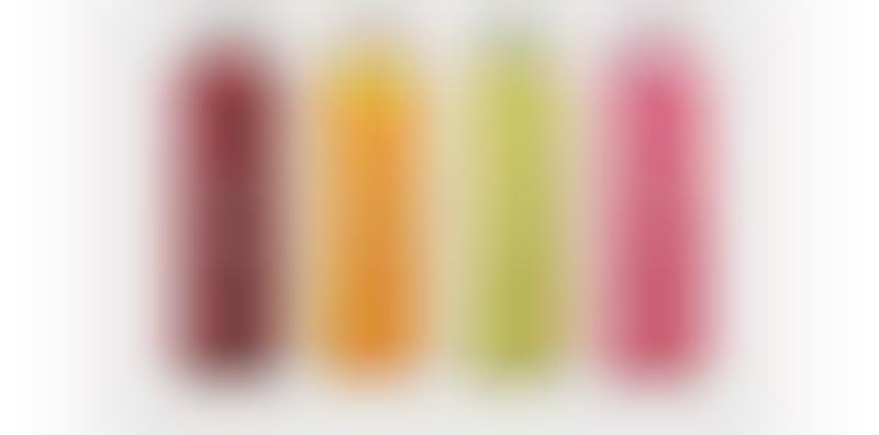
Foote based her design upon the concept of living simply and locally. The front of each transparent juice bottle (made from glass or clear plastic) features the juice's name, while the back lists its nutritional attributes.
What Makes This Trend Stand Out
- Sustainable Packaging
- The concept of clean organic branding presents an opportunity for innovative sustainable packaging solutions.
- Personalized Beverages
- The option for customers to create their own drink opens up possibilities for personalized beverage trends.
- Locally-sourced Ingredients
- The focus on locally-sourced organic beverages highlights the potential for trends in locally-sourced ingredients in the food and beverage industry.
Sectors Adopting This
- Food and Beverage
- The clean organic branding concept can bring disruptive innovation opportunities to the food and beverage industry.
- Packaging
- The trend towards sustainable packaging presents disruptive innovation opportunities in the packaging industry.
- Health and Wellness
- The concept of locally-sourced organic beverages aligns with health and wellness trends, offering opportunities for disruption in the industry.