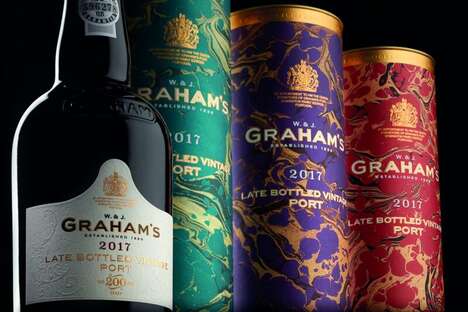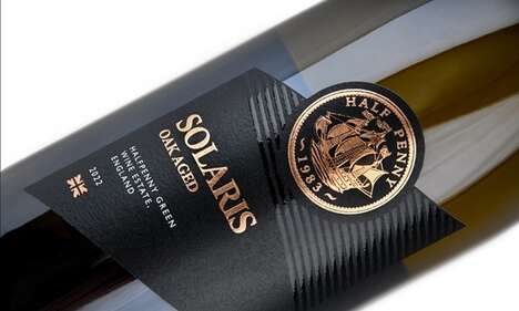
The designers behind Porter & Plot Wine packaging began with fairly modest sources of inspiration and ended up making the image of this grape-derived drink rather sophisticated. Looking to examples of antique porter bottles and basic packing labels, the DIA studio came up with a crisp brand identity that does well to represent the beverage's name.
The elegant look of the voluptuous black vessels was preserved by interrupting it as little as possible with stickers, text and symbols. Slim strips of adhesive paper were applied to Porter & Plot Wine packaging, clearly marking the type of vino and its origins with the clean Klim typeface. Every bottle is playfully capped with a melted wax seal that seems to drip down naturally.
What's Driving This Trend
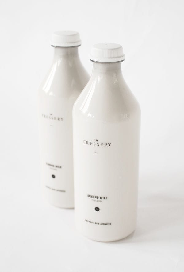
- Minimalist Packaging
- Exploring the use of clean and simple packaging designs that focus on the essentials, creating a sophisticated brand identity for products.
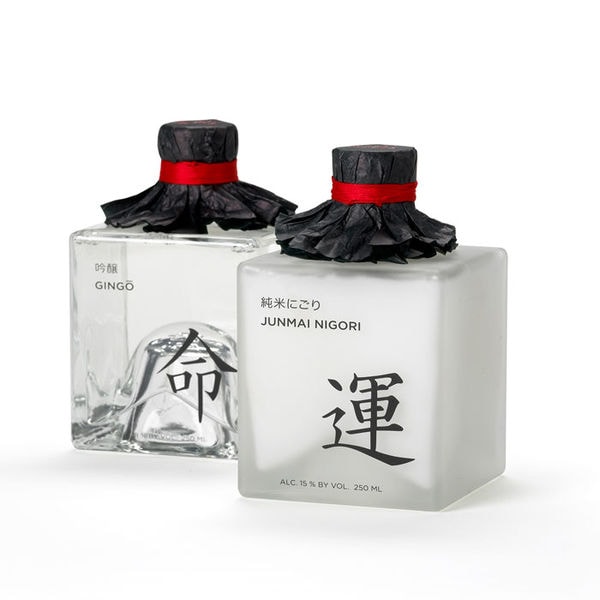
- Vintage-inspired Design
- Drawing inspiration from antique bottles and packing labels, creating a sense of nostalgia and uniqueness to stand out in the market.
- Elegant Branding
- Emphasizing the use of sleek and sophisticated branding techniques, such as wax seals and clean typography, to elevate the perceived value of the product.
Who This Affects Most
- Wine Industry
- Incorporating minimalist packaging and vintage-inspired design in wine branding can attract modern consumers who appreciate simplicity and authenticity.
- Craft Beer Industry
- Applying minimalist packaging and vintage-inspired design in craft beer branding can appeal to consumers looking for unique and traditional appeal in their beverage choices.
- Luxury Goods Industry
- Using elegant branding techniques in packaging for luxury goods can enhance the perception of exclusivity and craftsmanship, attracting high-end consumers.