Clean, crisp and simple may be the way that fermented grape drinks tend to be branded, but Pirie Tasmania Wine packaging exudes a delicious liquidity that channels the beverage's full-bodied fluidity and the form of the rolling Australian landscape from which it came.
Designed by students Magnus Henriksen and Amandus Bjerk of Norway, these bodacious bottles have a 1970s retro feel that suits the dressing of a vintage vino -- despite being as recent as 2006. The alcohol has been doused with a uniquely creative typeface that scrawls, swells, and leaves the rest of the label pure and pristine to divulge the true color of the wine within. Pirie Tasmania Wine packaging has a supple spirit that communicates the liquor's great flavor.
Why This Trend Is Growing
- Retro Branding
- Bringing back old-school design to connect with consumers emotionally.
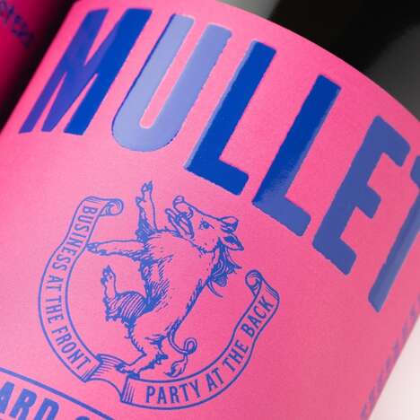
- Creative Typography
- Using unique typefaces to capture attention in a sea of similar products.
- Fluid Design
- Incorporating organic shapes and fluidity to represent the taste and origin of the product.
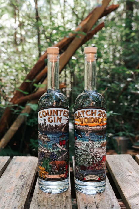
Industries Being Reshaped
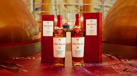
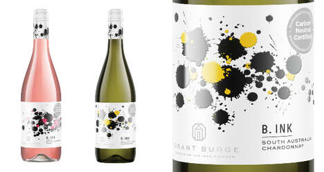
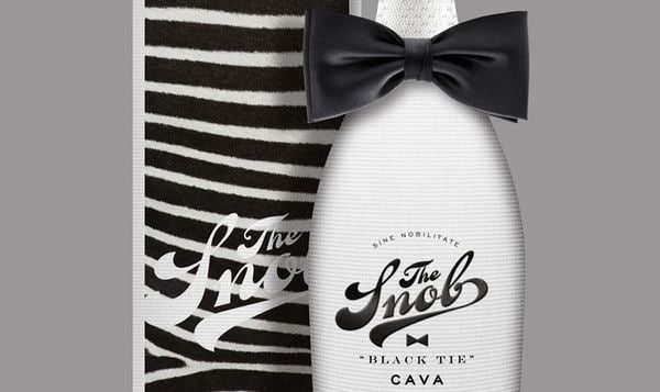
- Wine and Spirits
- Opportunities to leverage unique packaging to differentiate brands and justify higher price points.
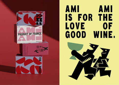
- Graphic Design
- Opportunities to experiment with creative typography and fluid design in product branding.
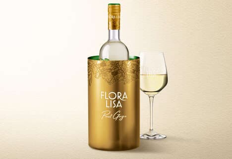
- Luxury Goods
- Opportunities to elevate perceived value by incorporating upscale design elements in product packaging.