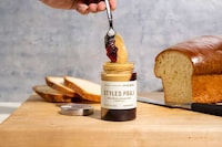
PB & Jams is a brand that was redesigned with the help of Luis E Quevedo, who decided on a slightly retro look. With the use of specific font and coloring, the peanut butter and jam takes on a nostalgic aesthetic of the past.
Quevedo also decided to add in certain hobbies of the founder of PB & Jams, using a spinning record in one area since the owner is a DJ. It's these small added details that makes this label so appealing. Moreover, since most of the label is done in brown, the few sections of color really pop out even more. Outlines of elephants have also been added, which gives the product a quirky and fun feel to it.
What Makes This Trend Stand Out
- Retro Packaging
- Companies can capitalize on the trend of retro packaging to appeal to consumers who value nostalgia.
- Personalized Branding
- Brands can incorporate personal details of the founder to make the product more relatable and appealing to consumers.
- Minimalistic Design
- Adopting a minimalistic design approach can make certain elements of the product stand out, making it more appealing to consumers.
Sectors Adopting This
- Food and Beverage
- Food and beverage industry can explore the trend of retro packaging for their products to make it more appealing to consumers.
- Design
- Design industry can offer personalized branding services to help companies create unique and relatable product packaging.
- Marketing
- Marketing industry can adopt a minimalistic design approach to make certain elements of a product stand out and create a more visually appealing brand image.