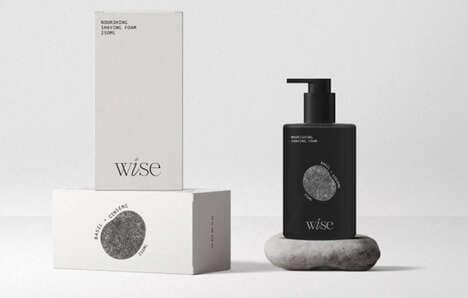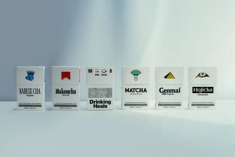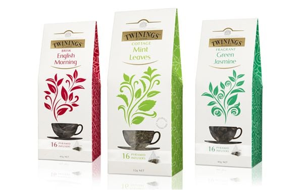
The notion of shelf appeal is undergoing a change. It seems that many consumers have an increasing interest in subtler brand identities rather than those with in-your-face graphics and color. Despite its muted palette, Paromi Tea packaging has certainly succeeded in getting noticed, having been picked up by Whole Foods since its image was reinvented.
R/West chose clay-hued gray jars as the vessels to hold 15 triangular teabags. The earthy aesthetic is consistent in the soil- and sand-tinted stickers that label each flavor. Elegant botanical drawings make handsome watermarks and help to represent the particular herbs and flowers that make up the loose leaf blends. Paromi Tea packaging exhibits just subtle differences, except for small lid seals in punchy colors that are intended to discriminate between them.
What Makes This Trend Stand Out
- Subtle Packaging
- The trend towards subtler brand identities is creating opportunities for packaging designs that use muted colors and elegant designs.
- Botanical Branding
- Brand identity designs that incorporate botanical drawings and naturalistic themes offer opportunities for disruptive innovation.
- Herbal Infusions
- The rising consumer interest in health and wellness is driving demand for unique and high-quality herbal infusions.
Sectors Adopting This
- Food and Beverage
- The food and beverage industry can use subtle packaging and botanical branding to create unique products that appeal to health-conscious consumers.
- Packaging
- Packaging companies can capitalize on the trend towards subtle packaging by creating high-end designs using refined materials and naturalistic motifs.
- Herbal Supplements
- The herbal supplement industry can capitalize on the rising interest in health and wellness by offering unique herbal infusion products that are beautifully packaged with naturalistic branding.