The Farmacia Frati Branding Embraces a Natural Medicine Approach
Jana Pijak — December 11, 2015 — Marketing
References: behance.net
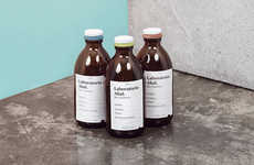
Designed by Costanza Pratesi, the Farmacia Frati brand identity is evocative of the pharmacy's natural medicine range. In addition to its artisanal logo and pale green graphics, this pharmacy also features paper and glass packaging that is inspired by botany.
Resembling natural remedies rather than traditional medicine bottles, Farmacia Frati's glass and paper packages are both sustainable and elegant. The pharmacy's logo also takes a minimalist approach, resembling signage seen in retro apothecaries.
This modern pharmacy uses simple and minimalist graphics to evoke Farmacia Frati's naturopathic approach to medicine. In addition to its natural medicine packaging, the brand also embraces an eco aesthetic when it comes to bags, business cards and other promotional materials that shoppers will take home with them once in store.
Trend Themes
-
Natural Medicine Packaging — Exploring sustainable and elegant packaging design inspired by natural remedies instead of traditional medicine bottles.
-
Minimalist Pharmacy Branding — Adopting a simple and minimalist approach to graphics and logo design, reminiscent of retro apothecaries.
-
Eco-friendly Promotional Materials — Embracing an eco aesthetic for bags, business cards, and other promotional materials that align with the pharmacy's naturopathic approach.
Industry Implications
-
Pharmaceutical Packaging — Opportunities for creating sustainable and visually appealing packaging designs that resonate with consumers seeking natural remedies.
-
Graphic Design — Incorporating minimalist and retro-inspired graphics for pharmacy branding, capturing the attention of customers looking for a unique and natural experience.
-
Sustainable Retail — Exploring eco-friendly materials and designs for promotional materials in the retail industry, catering to environmentally conscious consumers.
1.5
Score
Popularity
Activity
Freshness

