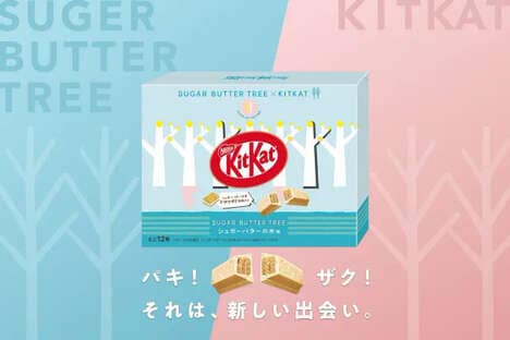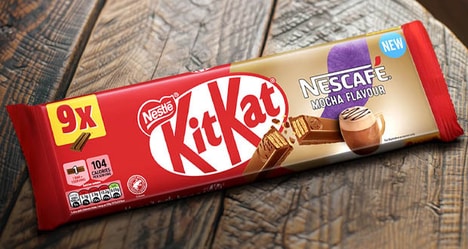
A recipe can be likened to a city with respect to the unique combination of constituents that compose it and the singular experience that it delivers. Kit Kat Cities packaging communicates the varied flavors of its contents though their association with different international metropolises.
Designer Andreia Encarnação of Portugal was given the task of dreaming up a brand identity for three separate varieties of a central product. The well-known Nestle chocolate bar was chosen and enveloped in one of a trio of delightful labels. A red wrapper has been drawn up to represent London, a blue one portrays Paris and a white one depicts New York City. In every example, Kit Kat Cities packaging is distinguishable by enchanting illustrations that sketch out the urban environments' distinctive landmarks and familiar features.
What's Driving This Trend
- Unique Packaging Designs
- Opportunity for brands to differentiate themselves by incorporating eye-catching and creative packaging designs that reflect local cultures and landmarks.
- Regional Branding
- Brands can tap into regional pride by using city-specific branding on their packaging, allowing consumers to connect with their favorite cities through their products.
- Artistic Packaging Illustrations
- Opportunity to leverage artists and illustrators to create custom packaging designs that showcase the unique landmarks and features of different cities, creating a visually appealing product packaging.
Who This Affects Most
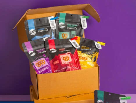
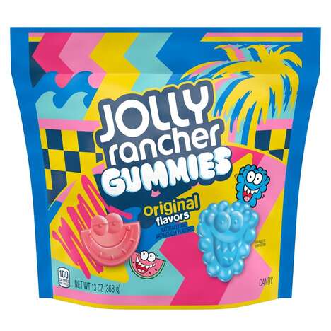
- Food and Beverage
- Food and beverage companies can explore incorporating city-themed packaging designs to enhance the consumer experience and create a sense of connection with specific cities or regions.
- Retail
- Retailers can collaborate with artists and designers to create exclusive packaging designs, attracting customers with visually appealing and unique product packaging.
- Tourism and Souvenir
- Tourism and souvenir industry can offer city-themed product packaging as a memorable and collectible item, catering to tourists and locals looking for unique souvenirs.