There's something both fresh and traditional about the aesthetic of Honey & Mackie's packaging, which are the same two qualities that draw consumers to the sweetness of ice cream cones in the first place. The incorporation of color, illustration and scrumptious keywords serve to make these napkin sheaths and paper cups about as delectable to the eyes as their contents are to the tongue.
One can always count on the Wink studio to churn out the absolute cutest in brand identity and graphic design, making it the perfect choice to bundle up this ice cream parlor's products to appeal to parents and children alike. The outlined animations and the typographical medley may remind adults of the images from their youth, while the bright assortment of inks and the clarity of composition give Honey & Mackie's packaging a contemporary taste that's irresistible to the kid in everyone.
What's Driving This Trend
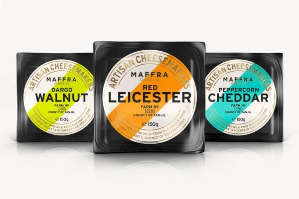
- Colorful Packaging
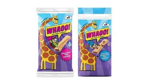
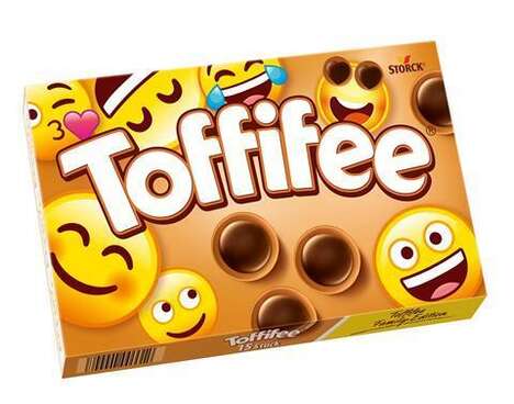
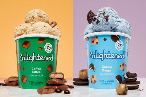
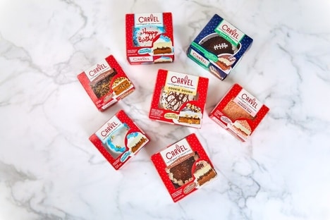
- The use of vibrant colors in packaging design presents an opportunity for brands to attract attention and stand out on store shelves.
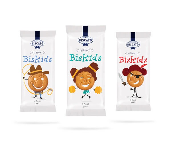
- Illustrative Branding
- Incorporating illustrations into branding can create a visually appealing and engaging experience for consumers, potentially leading to increased brand loyalty.
- Nostalgic Design
- Creating packaging that evokes nostalgia can resonate with consumers, especially adults, who are drawn to familiar and comforting visuals.
Who This Affects Most
- Food and Beverage
- The food and beverage industry can utilize colorful packaging, illustrative branding, and nostalgic design to enhance the appeal of their products and create memorable experiences for consumers.
- Catering and Event Planning
- Catering and event planning companies can explore the use of colorful packaging and illustrative branding to elevate their offerings, create a unique experience for clients, and leave a lasting impression.
- Retail and E-commerce
- Retailers and e-commerce businesses can leverage vibrant packaging design, illustrative branding, and nostalgic elements to differentiate their products, engage customers, and drive sales.