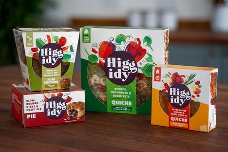
Minimalistic merchandizing is a technique that's gained popularity as of late, and an example such as The Hill Station packaging demonstrates why it's so successful. Clarity has become a virtue in a world in which grocery stores are stocked full of glaring competitive products, ironically raising the stock of the simpler-looking ones which charm consumers.
But the fresh local Vietnamese products, conserves and infusions that are sold through the fine restaurant and boutique deli may have little retail competition. The establishment, which is nestled within an old French mountain outpost, caters to a sophisticated clientele who appreciate cleanliness and uniformity in brand identity design. However, for a little subtle flavor, Studio Egregius infused the jar labels The Hill Station packaging with a hint of Indochine style.
Key Themes Behind This Trend
- Minimalistic Merchandizing
- Disruptive innovation opportunities include creating clean, simple packaging designs that stand out in a crowded market.
- Hybrid Historical and Contemporary Look
- Opportunities for disruptive innovation lie in developing packaging designs that blend elements of the past with a modern aesthetic.
- Clarity and Uniformity in Brand Identity Design
- Creating streamlined, cohesive brand identities can be a disruptive innovation opportunity for businesses looking to cater to a sophisticated clientele.
Where This Applies
- Food and Beverage
- Developing innovative packaging designs for food and beverage products can help brands stand out on store shelves.
- Hospitality
- Hotels, restaurants, and boutique delis can utilize disruptive innovation by incorporating unique and cohesive brand identities into their establishments.
- Retail
- In the competitive retail industry, disruptive innovation can arise from creating clear and compelling packaging designs for products.