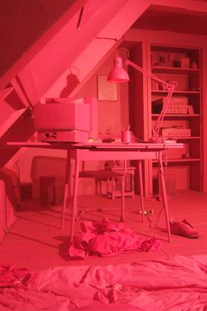
Designers Bauke Knotterus and Anna Ter Haar have teamed up to create "De Camping" -- a bar covered in bright magenta paint. The project took place in Rotterdam and resulted in quite the visual feat.
For "De Camping" everything was covered -- and I mean everything -- with a Pepto Bismol-colored hue that saturated the entire space. Bauke Knotterus loved the concept so much, he also did the same in a bedroom. See the blushing shots above.
Key Themes Behind This Trend
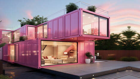
- Hyper-saturated Spaces
- Designers are experimenting with highly-saturated, monochromatic color schemes to create visually impactful spaces.
- Monochromatic Branding
- Brands are using highly-saturated, monochromatic color schemes across all touchpoints to create consistent and memorable visual identities.
- Multi-sensory Experiences
- Designers and brands are creating immersive, multi-sensory experiences by incorporating vibrant colors and bold branding elements.
Where This Applies
- Hospitality
- Hotels, restaurants, and bars can create visually striking, Instagram-worthy spaces that draw in customers and set their brand apart.
- Retail
- Retail stores can experiment with bold, monochromatic branding and in-store experiences to create a lasting impression on customers.
- Branding and Advertising
- Agencies and consultants can work with brands to create unified, visually impactful branding initiatives across all touchpoints.