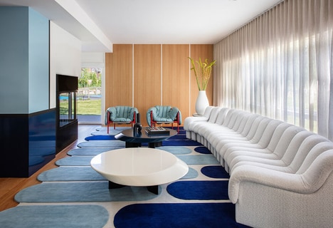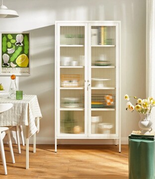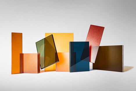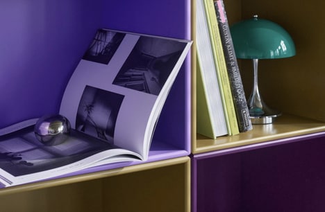
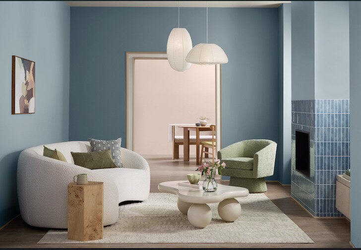
Valspar has selected Cottage Door 8004-38E as its 2027 Color of the Year — a mid-tone neutral blue that balances warm and cool undertones to create a reflective, grounded atmosphere intended to evoke authenticity and quiet confidence within interior spaces.
The Cottage Door 8004-38E shade moves beyond the starkness of cool blues and the heaviness of darker navies, offering instead a versatile hue that adapts to various lighting conditions while maintaining a sense of familiarity and emotional security. This shade moves beyond the starkness of cool blues and the heaviness of darker navies, offering instead a versatile hue that adapts to various lighting conditions while maintaining a sense of familiarity and emotional security align with contemporary consumer preferences for environments that feel less staged and more genuinely lived-in.
Image Credit: Valspar
What's Driving This Trend
- Grounded Color Palettes
- Neutral blue tones signal a shift toward interiors that balance emotional comfort with design versatility, creating space for paint, décor, and material brands to develop calming yet adaptable home aesthetics.
- Lived-in Minimalism
- Consumer interest in less staged environments reflects demand for products and finishes that feel authentic, imperfect, and personal while still supporting refined contemporary design.
- Adaptive Interior Hues
- Colors that respond well to changing light conditions highlight opportunities for smarter surface treatments, curated palettes, and visualization tools that simplify confident home design decisions.
Who This Affects Most
- Paint and Coatings
- Mid-tone neutrals expand the role of paint beyond decoration into emotional atmosphere, opening differentiation for brands through wellness-led color systems and lifestyle-based collections.
- Interior Design
- Reflective, familiar shades support a softer approach to residential spaces where designers can blend comfort, authenticity, and sophistication across varied home styles.
- Home Décor
- Furniture, textiles, and accessories aligned with balanced blue neutrals can help consumers create cohesive interiors that feel calm, grounded, and intentionally personal.