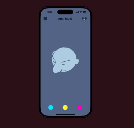
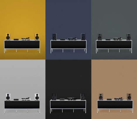
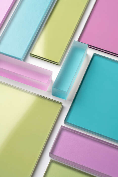
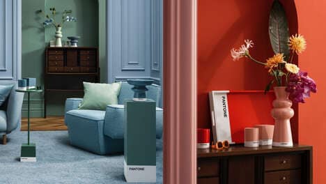
Confused Direction is a German design company that created colourcourage. They describe the project as a “coloursystem,†meaning that the colors are chosen purposefully, and designed to work together. An interesting aspect of the colourcourage project is that the designs also look great in black and white.
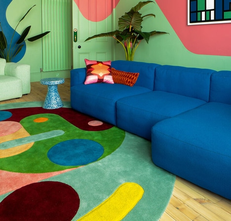
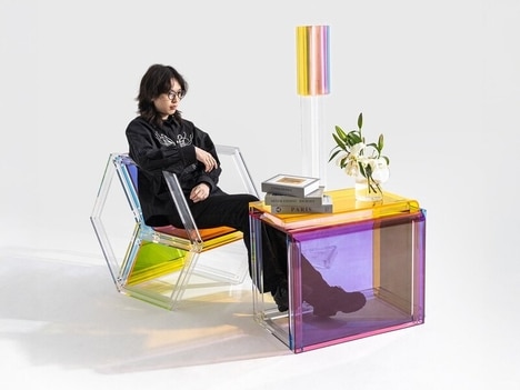
Implications - The designer of the interesting color system is Lars Contzen, who works to create designs that are harmonized by color schemes. The featured images show off a color scheme in black, white, blue and pink. The colors are in squares, which look like tiles on the wall. The brightness looks great and matches with the modern-looking furniture around the room. Confused Direction is definitely an innovative interior look.
What's Driving This Trend
- Coordinated Color Systems
- Designers are increasingly creating harmonized color schemes to enhance interior looks.
- Interchangeable Colors
- Designers are developing color systems with colors that can work together interchangeably.
- Minimalist Design
- Designers are using minimalism in interior design to marry the functional and aesthetic aspects of interior spaces.
Who This Affects Most
- Interior Design
- Interior designers can use coordinated color systems to create a more sophisticated, modern look for clients.
- Home Decor
- Home decor companies can leverage interchangeable color systems to provide customers with versatile home decor options.
- Furniture
- Furniture companies can use minimalist designs to create functional and aesthetically pleasing furniture.