Aroma by 2Yolk is a drugstore brand that sells shampoo, conditioners and body soaps. The design company was looking to differentiate this brand from others on the shelves, so decided against depicting real splashes of water and fruit. Instead, they used shapes and colors to represent these items, but everything was done in more of a surreal way.
2Yolk states its intention with this line on Lovely Package, stating that they "chose stylized, abstract depictions of the two main ingredients: olive leaves dancing with balsam flowers, bay leaves and golden sesame oil, and milk and honey. The typography is sharp and black, an interesting counterpoint to the bright colour palette of the graphic design.” While the package looks similar to other drugstore brands, it still stands out with the abstract design.
Why This Trend Is Growing
- Abstract Packaging Design
- Disruptive innovation opportunity: Explore unique and unconventional packaging designs to differentiate brands in crowded markets.
- Surreal Graphic Design
- Disruptive innovation opportunity: Incorporate surreal and artistic elements in graphic design to create visually appealing and memorable product packaging.
- Typography Contrast
- Disruptive innovation opportunity: Experiment with sharp and contrasting typography to create striking visual effects on packaging labels.
Industries Being Reshaped
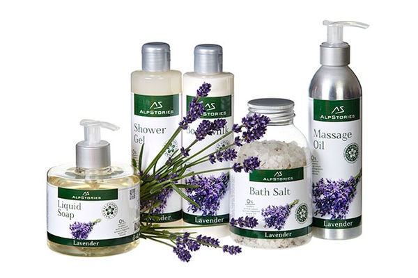
- Beauty and Personal Care
- Disruptive innovation opportunity: Integrate abstract and surreal design elements to create standout packaging for shampoo, conditioners, and body soaps.
- Graphic Design Services
- Disruptive innovation opportunity: Provide graphic design services that specialize in creating abstract and surreal designs for packaging products.
- Printing and Packaging
- Disruptive innovation opportunity: Offer printing and packaging solutions that cater to brands seeking abstract and artistic packaging designs.