


This Graphic Design from Philipp Hopta is Catchy and Adaptable
Josh Triantafilou — May 7, 2012 — Marketing
References: pulaski-pompano & behance.net
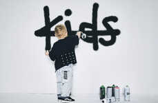
The creative director Philip Hopta of the agency Pulaski+Pompano in Kiev, Ukraine, recently unveiled a naming, logo and style guide for a Japanese online shop of kidswear on his Behance page.
The design is simple, punchy and wonderfully childish. It features the name of the store, Yokoko, rendered in bright vibrant colors -- red, green and blue -- that immediately catch one's eye. Interspersed among the letters are the faces of three kids emoting distinct personalities. One kid is happy and content, another is indignant and a bit rebellious while the third is dazed and confused. Such elements give the design variety; no two colors or kids are the same. Yet, it maintains a sense of cohesion.
This cogency and simplicity allows the decal to be put on anything, from keychains to wrapping paper.
Trend Themes
1. Childlike Branding - Opportunity for businesses to create simple and playful designs that appeal to a younger audience.
2. Vibrant Color Palettes - Disruptive innovation opportunities in using bold and eye-catching colors to stand out in branding.
3. Emotive Graphic Design - An opportunity for businesses to convey emotions and personalities through visual elements in their branding.
Industry Implications
1. E-commerce - Opportunity for online retailers to enhance their branding and engage with younger customers through childlike designs.
2. Graphic Design - Disruptive innovation opportunities for graphic designers to explore new approaches in creating vibrant and emotive branding.
3. Printing and Packaging - Opportunity for printing and packaging companies to offer customized solutions using versatile and adaptable branding decals.
3.2
Score
Popularity
Activity
Freshness