


House Wine Co. Packaging Has the Sincerity of an Old Schoolhouse
Amelia Roblin — May 13, 2011 — Life-Stages
References: insitedesign & lovelypackage
Ordering the "house wine" may seem like a generic choice for some, but just about anyone can appreciate the charm behind House Wine Co. packaging.
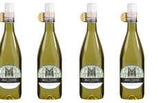
Bringing new meaning to a near clean-skin drinking experience at the bar, the makers of these alcoholic grape beverages proudly serve up "White House" and "Red House" wines that flip the usual sequence of the pair of words. As a result, the color looks to describe the house itself, and this gives these products a fetching, home-style image. The labeling, done by Insite Design, enhances such an identity, with a playful aesthetic decision to brand the bottles with chalk-written text.
Conjuring up a reference to an old, red schoolhouse or those foundational years in the classroom, House Wine Co. packaging has a youthful appeal that communicates a back-to-the-basics flavor, infused with a sense of sprightly enthusiasm.
Trend Themes
1. Back-to-basics Packaging - Disruptive innovation opportunity: Explore packaging designs that appeal to consumers' desire for simple, nostalgic experiences.
2. Chalkboard Branding - Disruptive innovation opportunity: Implement chalk-written text in product branding to evoke a sense of playfulness and youthfulness.
3. Reversing Word Sequences - Disruptive innovation opportunity: Experiment with flipping the usual order of words in branding to create unique and memorable product identities.
Industry Implications
1. Beverage Packaging - Disruptive innovation opportunity: Introduce unconventional packaging designs in the beverage industry to stand out on the shelves.
2. Alcoholic Beverages - Disruptive innovation opportunity: Utilize creative branding techniques to attract consumers seeking unique and unconventional alcoholic drinks.
3. Graphic Design - Disruptive innovation opportunity: Embrace playful and unconventional graphic design elements to create memorable brand identities across industries.
2.3
Score
Popularity
Activity
Freshness