


Sugar Cafe Packaging Stirs Up a Sweet Stylus Emblem
Amelia Roblin — January 24, 2011 — Lifestyle
References: seamlesscreative & thedieline
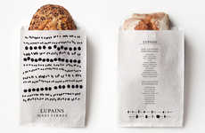
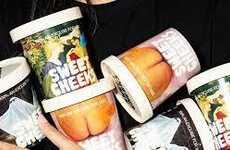
Delectable graphic design has won my heart again, in the form of the new Sugar Cafe packaging. Drafted by Seamless Creative, this New York City sweets shop's image is as delicious to the eyes as its confections are to the taste buds.
The classic logo was hand written to emphasize the brand's artisan abilities and looks much like a chocolate-drizzled script. Keeping it simple with brown paper bags and boxes, Sugar Cafe packaging achieves a mouth-watering minimalism that will not compete with the treats within.
The classic logo was hand written to emphasize the brand's artisan abilities and looks much like a chocolate-drizzled script. Keeping it simple with brown paper bags and boxes, Sugar Cafe packaging achieves a mouth-watering minimalism that will not compete with the treats within.
Trend Themes
-
Handwritten Branding — Opportunities for companies to create a unique and personal brand image by using hand-drawn or handwritten logos and typography.
-
Minimalist Packaging — Opportunities for companies to differentiate their products and create a premium feel by using sleek and minimalist packaging designs.
-
Delectable Graphic Design — Opportunities for designers to create visually appealing designs that evoke the taste and quality of the products being sold.
Industry Implications
-
Food and Beverage — Food and beverage companies can leverage minimalist packaging and delectable graphic design to create a premium and memorable brand image.
-
Crafts and Arts — Companies in the crafts and arts industry can use hand-drawn or handwritten branding to differentiate their products and create a unique and personal brand image.
-
Retail — Retail companies can use minimalist packaging and visually appealing design to attract customers and create a premium shopping experience.
5.3
Score
Popularity
Activity
Freshness