Slingshot Wine Packaging Truly Targets its Consumers
Amelia Roblin — July 27, 2012 — Lifestyle
References: cfnapa & thedieline
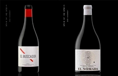
Vino labels provide interesting creative studies since graphic designers are forced to really think outside of the box, yet within the limiting boundaries of rectangular stickers. Slingshot Wine packaging presents a coherent image with an iconic quality, centered around a red, black and white bull's eye and a minimal amount of text.
There is an authenticity to CF Napa's branding strategy, communicated through the vintage-style faded ink, the sophisticated lettering and the etched logo at the base of the label. This aesthetic is sure to appeal to seasoned cabernet sauvignon drinkers. But Slingshot Wine packaging isn't without its playful side that pertains to its very name. A puncture mark in the paper gives the graphic tangible character.
There is an authenticity to CF Napa's branding strategy, communicated through the vintage-style faded ink, the sophisticated lettering and the etched logo at the base of the label. This aesthetic is sure to appeal to seasoned cabernet sauvignon drinkers. But Slingshot Wine packaging isn't without its playful side that pertains to its very name. A puncture mark in the paper gives the graphic tangible character.
Trend Themes
-
Authentic Vintage-style Design — Opportunity for designers to create branding strategies that communicate authenticity through vintage-style elements.
-
Minimalist Wine Packaging — Opportunity to create wine labels with a minimal amount of text and a coherent, iconic image.
-
Playful Design Details — Opportunity to incorporate playful elements into packaging design, such as puncture marks that add tangible character.
Industry Implications
-
Wine and Spirits — Branding opportunities for wine and spirits companies to create authentic, minimalist and playful packaging designs.
-
Graphic Design — Opportunities for graphic designers to explore vintage-style design and incorporate playful design details into packaging projects.
-
Marketing and Advertising — Opportunities for marketers to leverage authentic, minimalist and playful packaging designs to target specific consumers and enhance brand image.
2.2
Score
Popularity
Activity
Freshness
