NOT ON FRONT PAGE

Revamping Iconic Food

Pepsi Rebranded With New Logo Is Hard To Swallow

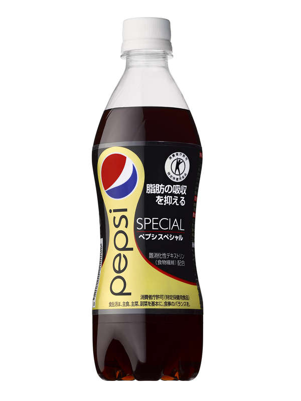
Pepsi has released their new logo and it is fair to say it is not loved by everyone. In fact, the online complaints makes it look as if the London 2012 Olympic Logo was critically acclaimed.

Technically, the new logo is
a flattened derivative of the previous one with a right-slanting organic swell, a curiously pregnant white diagonal line traversing the logo.

Personally, for the millions spent, I would have loved to see a much more major change, but in a sadly predictable manner, the brand did not have the balls to do so.

SCORE
0.3 out of 10
GENDER
70% Men30% Women
MARKETTop markets: North America, South America, Europe, Asia
GENERATION
  • Gen Alpha
  • Gen Z (primary audience)
  • Millennial (primary audience)
  • Gen X (primary audience)
POPULARITY
Popularity 0%
Activity 0%
Freshness 8%

Solutions for innovators working at the edge of change. We help transform emerging ideas into practical, durable solutions by combining strategic thinking, creative exploration, and hands-on execution.

Trends © 2026 Trend Hunter Inc. All Rights Reserved.
LinkedIn Instagram X