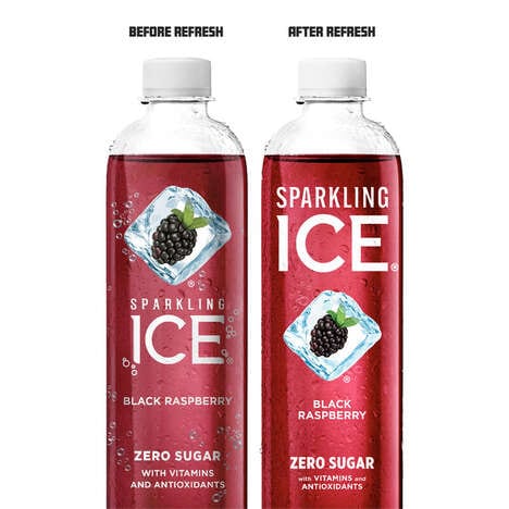
The beauty of Purps packaging is that it you can quickly grasp the two proud features of the product upon one quick glance. The logo simply comprises a recognizable pair of running legs, and -- besides the text -- the bottles and cans are coated in a pure coat of shrink-wrapped white plastic.
The colorless backdrop of the beverage containers communicates a clean image, doing well to represent the recipe behind the product. The drinks are made with high quality organic ingredients that are intended to contribute to a healthy lifestyle. Meanwhile, looking like lightening bolts, the legs express a power than can be gained by consuming the energy drink. Purps packaging is easily read and visually punchy, making it stand out against its competitors on the shelf.
Why This Trend Is Growing
- Minimalistic Packaging
- Brands can adopt a simple and clean packaging design that clearly communicates the product's ingredients, benefits, and lifestyle goals to appeal to health-conscious consumers.
- Visual Branding
- Brands can use bold and recognizable visual elements in their packaging, such as the Purps running legs, to create a strong and memorable brand identity that sets them apart from competitors on store shelves.
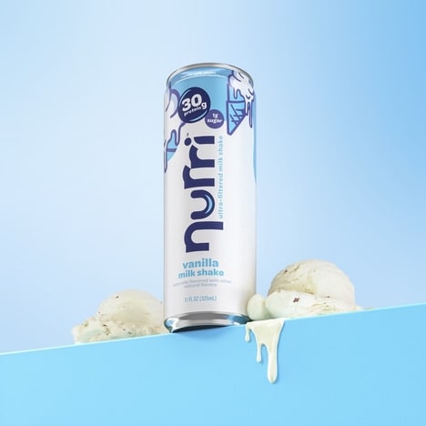
- Energy-boosting Products
- There is a growing consumer demand for energy drinks made with organic and high-quality ingredients that provide a natural and sustained energy boost, creating an opportunity for companies to innovate in this space.
Industries Being Reshaped
- Beverage
- Beverage companies can adapt a visually striking and health-focused packaging design to promote their organic and natural energy-boosting products to health-conscious consumers.
- Sporting Goods
- Sporting goods companies can adopt a similar visual branding strategy as Purps, using recognizable and bold imagery to create a strong brand identity for their athletic performance products.
- Health and Wellness
- Companies in the health and wellness industry can capitalize on the growing trend for energy-boosting products by developing new and innovative products that offer natural and sustained energy for consumers.