Gleem Toothpaste's Brand Identity is Vibrant and Convenient
Jana Pijak — September 24, 2015 — Marketing
References: behance.net
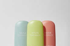
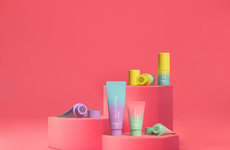
Texan designer Rachel Albers conceived Gleem toothpaste's clever brand identity -- a re-design that features vibrant graphics and convenient pump packaging. Synonymous with hand creams and lotions, pump packaging ensures one is using just the right amount of product and not wasting a container's contents.
Mixing artful graphics, recyclable packaging and a convenient pump mechanism, designer Rachel Albers creates toothpaste containers that are both visually striking and convenient. While cosmetics and perfumes are known for their elegant design -- one consumers are proud to display on their vanity -- oral care products are often left simple and clinical in their look and feel.
This toothpaste's packaging is chic enough to place next to a designer perfume or hand lotion and features a handy pump dispenser that reduces product waste.
Trend Themes
1. Vibrant Toothpaste Packaging - Opportunity to create toothpaste packaging that is visually appealing, like designer perfumes or hand lotions.
2. Convenient Pump Mechanism - Chance to incorporate a pump dispenser into toothpaste packaging to reduce product waste.
3. Artful Graphics in Oral Care - Potential to introduce artistic graphics into the traditionally plain and clinical design of oral care products.
Industry Implications
1. Cosmetics - Cosmetics industry could adopt pump packaging for various products, enhancing convenience for consumers.
2. Packaging - Packaging industry can explore the use of artful graphics and pump mechanisms in oral care products to differentiate their offerings.
3. Consumer Goods - Companies in the consumer goods sector can leverage vibrant toothpaste packaging to attract customers and enhance brand identity.
3.4
Score
Popularity
Activity
Freshness

