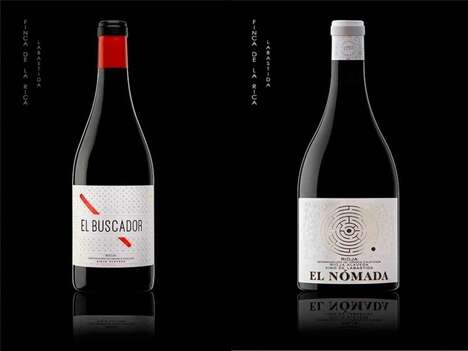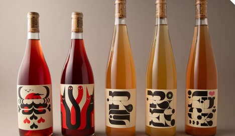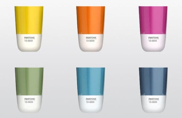
When tasting vino, the color is often as important to note as the flavor, and this very fact has influence the way Plural Wine packaging functions. Brand Session is behind the bold new look of the bottled beverage, inspired -- believe it or not -- by interior design.
Each make of the fermented grape drink has been paired with a Pantone paint chip that fits the flavor. The overall image created thus reminds the drinker that wine is about so much more than taste, bringing the senses of smell of course sight into the mix. Incorporating the makers' traditional bull logo on a much smaller scale, the refreshed Plural Wine packaging gives the alcoholic drink a brilliant spirit that appeals to the modern consumer.
What's Driving This Trend
- Color-driven Packaging
- Opportunity to incorporate color as a key element in product packaging to enhance consumer experience and highlight unique characteristics.
- Multisensory Branding
- Opportunity to engage multiple senses, such as sight and smell, through thoughtful packaging design to create a more immersive consumer experience.
- Cross-industry Inspiration
- Opportunity to draw inspiration from other industries, such as interior design, to create unique and captivating product packaging.
Who This Affects Most
- Wine and Spirits
- Opportunity for wineries and distilleries to leverage color-centric packaging to differentiate their products and engage consumers on an emotional level.
- Packaging Design
- Opportunity for packaging designers to explore innovative approaches that go beyond visual aesthetics and create packaging that appeals to multiple senses.
- Interior Design
- Opportunity for interior design professionals to expand their creative influence by collaborating on packaging design projects and bringing their unique perspective.