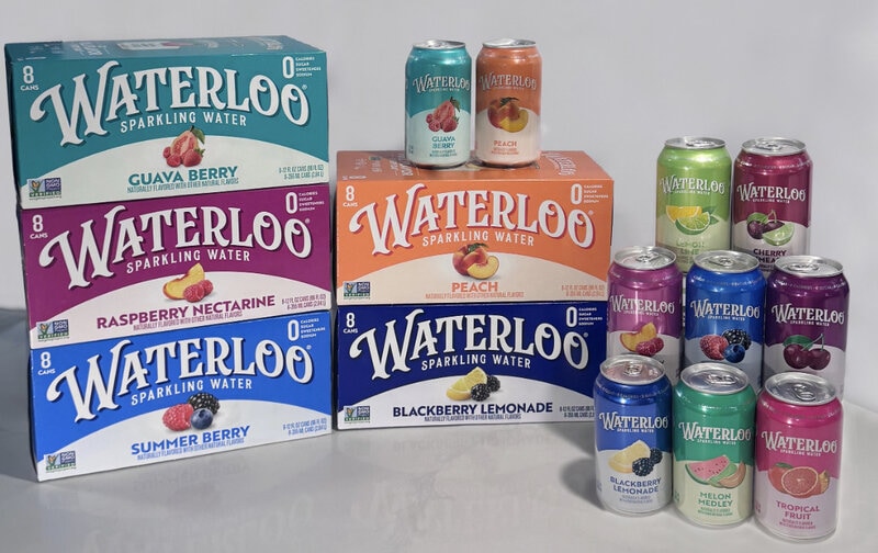
Waterloo Sparkling Water has introduced a comprehensive packaging redesign across its entire product portfolio, marking the first such update since the brand’s launch in 2017. The new carton and can graphics are now appearing in retail stores and online channels nationwide.
Waterloo Sparkling Water's refreshed visual system, developed in collaboration with the brand agency CBX, features more saturated and vibrant colors, a cleaner overall layout, stronger appetite-inducing flavor cues such as larger fruit imagery, and a modernized brand mark. All elements in this comprehensive packaging redesign are intended to increase shelf visibility and make it easier for shoppers to quickly distinguish between different flavor varieties.
Ultimately, the updated look also reinforces the brand’s core positioning around 'full flavor' and its WATER DOWN NOTHING campaign.
Image Credit: Waterloo Sparkling Water
What's Driving This Trend
- Shelf-first Visual Systems
- Bright, simplified packaging architectures create room for brands to win attention in crowded retail aisles while improving rapid product recognition.
- Flavor-led Design Cues
- Larger ingredient imagery and appetite-driven color palettes signal opportunities for sensory branding that makes taste expectations clearer before purchase.
- Portfolio-wide Brand Refreshes
- Coordinated redesigns across entire product lines can strengthen brand consistency while helping shoppers navigate expanding flavor and format choices.
Who This Affects Most
- Beverage Packaging
- Premium visual updates in cans and cartons highlight new potential for packaging to function as both a brand billboard and a shopper navigation tool.
- Retail Merchandising
- More distinctive shelf presentation supports innovation in planogram strategy, impulse conversion, and product differentiation across competitive beverage sets.
- Brand Design
- Modernized identity systems reveal growing demand for agencies that blend visual impact, consumer psychology, and omnichannel consistency.