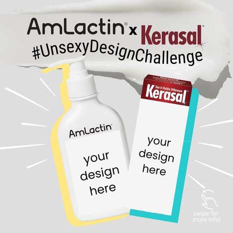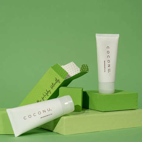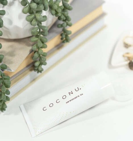
When a person shops for personal lubricant, he or she is generally looking for something quite simple -- something that's presented like Bonk Lube packaging. Brienne Welsh of New York has developed a branding strategy for an intimate jelly that's stripped of the nasty chemicals and the unnecessary scents and flavors, promising only high quality organic ingredients.
To communicate such a pure and clean product, the designer began with a plain white tube. The name of the lotion is written clearly in a playful but coherent typeface and the amount of text has been naturally reduced. Bonk Lube packaging includes an earthy-looking brown card box to reference its raw ingredients. Finally, both containers are branded with a crisp logo of intertwining male and female symbols to reinforce the sexual theme.
Key Themes Behind This Trend
- Clean Label Movement
- The trend of using minimalistic and transparent packaging to emphasize natural and organic ingredients as a key selling point opens opportunities for new organic, non-toxic, and sustainable product development in the personal care industry.
- Gender-neutral Marketing
- The trend of gender-neutral branding in personal care products challenges companies to rethink the traditional packaging and marketing strategies to cater to today's diverse and inclusive consumer base.
- Sensory Experience
- The trend of engaging multiple senses in packaging design such as touch, sight, and smell presents opportunities for brands to create more immersive and memorable experiences through innovative packaging design.
Where This Applies
- Personal Care
- The Personal Care industry can capitalize on clean label and sensory experience trends to develop safer and more engaging products for consumers looking for more natural, ethically sourced, sustainable, and convenient products.
- Sexual Wellness
- The Sexual Wellness industry can benefit from the trend of gender-neutral marketing and clean labels, by developing innovative products that cater to the diverse and evolving needs of consumers who prioritize sexual health, intimacy, and safety.
- Eco-friendly Packaging
- The Packaging industry can create disruptive innovation opportunities by developing more sustainable and minimalistic packaging solutions that reflect clean label, gender-neutral, and sensory trends, and reduce waste, carbon footprint, and excessive material usage.