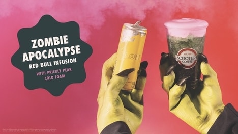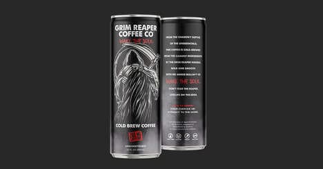

The design concept of After Dark uses images of zombies and ghostly figures who aren't quite dead to promote the energy drink. This label plays with the idea that this energy drink will bring you back or at least give you that extra boost of energy to keep you going.
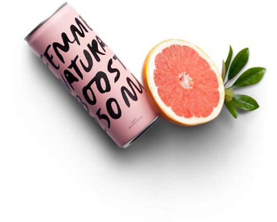
After Dark is directed towards college students who use energy drinks to pull them through late nights and long hours of studying on campus. The labels use colors of black, white and gray. Each flavor uses a different colored can to be distinguishable but still cohesive to the brand.
The typography used is in a Halloween-inspired text that is thick lettered and looks as if someone wrote it by hand while they were shaking. The ghoul-esque design is intriguing and promotes the idea of energy drinks as a life-saving tool for students.
Key Themes Behind This Trend
- Zombie-branded Products
- Exploring the use of zombie imagery to create unique and eye-catching brand experiences.
- Targeting College Students
- Understanding the specific needs and preferences of college students as a niche market for energy drinks.
- Halloween-inspired Design
- Leveraging the visual elements of Halloween to create captivating and memorable product packaging.
Where This Applies
- Beverage Industry
- Identifying opportunities for energy drink brands to stand out and appeal to specific consumer segments through innovative branding strategies.
- Marketing and Advertising
- Exploring creative approaches and design concepts that can be applied to promote products and engage target audiences.
- Higher Education
- Recognizing the potential for energy drink brands to target college students as a lucrative consumer group for late-night studying and energy-boosting products.