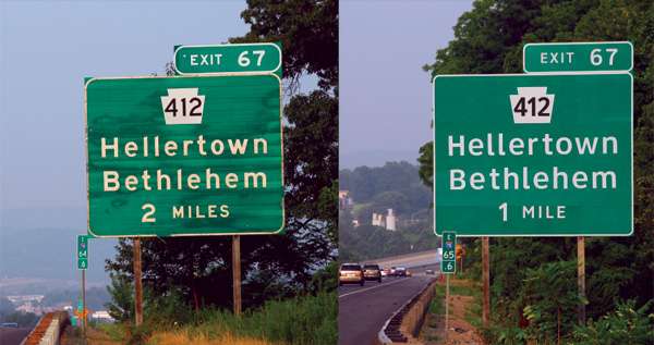
Every country has a distinct highway sign font (lettering design) that adds local personality and style. In American, Highway Gothic has been the official font for the last fifty years. It was designed before there were reflective paints and halogen headlamps that cause signs to get all fuzzy and hard to read at night, a phenomenon called halation.
Don Meeker, an environmental graphic designer, and James Montalbano, a type designer spent more than ten years tweaking and testing the typeface they call Clearview and running down Federal bureaucracies until they convinced enough of the right people that they had a winner. As old Highway Gothic signs are coming down new Clearview signs are going up. Most people won't notice the change but the signs will be easier to read at night and from at least 200 ft (60m) further away. Even AT&T adopted Clearview for all its advertising and corporate communications and in a follow-up survey, positive consumer response to its brand name had doubled.
Key Themes Behind This Trend
- Improved Legibility
- Clearview font offers better readability at night and from a greater distance, providing an opportunity for industries to enhance visibility and ensure safety in signage.
- Design Customization
- The shift from Highway Gothic to Clearview font allows for the customization of highway sign fonts, presenting an opportunity for industries to incorporate localized and branded designs.
- User-centered Design
- The development of Clearview font showcases the importance of user-centered design, presenting an opportunity for industries to prioritize user experience and optimize readability in their products or services.
Where This Applies
- Transportation
- The adoption of the Clearview font in road signs can revolutionize the transportation industry by improving safety and legibility for motorists and providing a disruptive opportunity for signage companies.
- Advertising and Marketing
- AT&T's adoption of Clearview for its advertising and corporate communications highlights the potential in the advertising and marketing industry to utilize the font for improved brand visibility and consumer response.
- Graphic Design
- The shift to Clearview font emphasizes the significance of graphic design in enhancing readability and user experience, creating opportunities for graphic designers to innovate and collaborate with various industries.