


Roboto Typeface Receives a Revamp from Google
Jamie Danielle Munro — July 18, 2014 — Art & Design
References: google & designboom
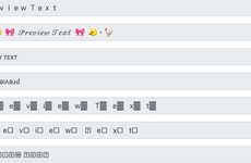
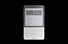
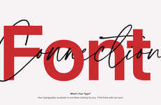
Roboto typeface has been upgraded thanks to Google and Material Design Guidelines. The new font is specific for screens, which makes sense given the digital age that people live in these days.
"Changes to the font include tuning to work across more screen sizes and conditions, from watches to desktops, televisions to cars," states DesignBoom. This should allow people to read messages easier, and avoid straining the eyes too much. The font itself is very minimalist with a clean and clear design, and even the smallest of changes to this typeface made a difference. For something like lettering, even just an elongation of a line can give an T a completely different look.
Hopefully these changes will allow people to read items on their digital screens without too much strain on the eyes.
Photo Credits: designboom, google
Trend Themes
1. Screen-specific Fonts - Developing fonts specifically designed for screens presents an opportunity for improving readability and reducing eye strain.
2. Upgraded Typeface Design - Revamping typefaces like Roboto to optimize readability across various screen sizes and conditions offers innovative possibilities for user experience.
3. Minimalist Font Design - Exploring minimalist and clean font designs can lead to visually appealing and eye-friendly typography solutions for digital screens.
Industry Implications
1. Technology - The technology industry can benefit from screen-specific fonts to enhance user interfaces and optimize readability on various digital devices.
2. Graphic Design - The graphic design industry can leverage the upgraded typeface design to create visually striking and reader-friendly digital content.
3. User Experience - The user experience industry can utilize minimalist font designs to improve readability and overall aesthetics in digital interfaces.
2.1
Score
Popularity
Activity
Freshness