


The Henry Hargreaves Bacon Alphabet is Deceptively Sophisticated
Meghan Young — October 12, 2011 — Lifestyle
References: henryhargreaves & psfk
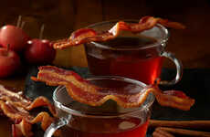
The Bacon Alphabet addresses the American obsession with this porky delight and also references a bigger picture, the rather disgusting American diet.
Aside from the fact that actual pieces of bacon were used to create this delicious typography, the interesting part of this project is the use of medieval calligraphy as the chosen font. By employing this particular font, the Bacon Alphabet fools itself, as many American citizens do, about the health factor in such meat and other food choices.
Created by Brooklyn-based photographer Henry Hargreaves, the Bacon Alphabet also shows that bacon-inspired products are not going anywhere soon. The Bacon Alphabet demonstrates that artists and designers will continue to take this food to a whole new level.
Trend Themes
1. Bacon-inspired Art - Artists and designers are exploring creative ways to incorporate bacon into their artwork, showcasing the enduring popularity of this food trend.
2. Medieval-inspired Typography - The use of medieval calligraphy in design projects presents a unique opportunity for innovation and nostalgia-inspired marketing campaigns.
3. Health-conscious Food Choices - The Bacon Alphabet project highlights the growing concern and interest in healthier food choices, paving the way for disruptive innovations in the food industry.
Industry Implications
1. Food and Beverage - The bacon trend opens up opportunities for food and beverage companies to create innovative bacon-infused products and capitalize on consumer demand.
2. Art and Design - The Bacon Alphabet project exemplifies the potential for creating bacon-themed art and design products that resonate with consumers.
3. Typography and Graphic Design - The use of medieval calligraphy in design projects creates opportunities for typographers and graphic designers to explore unique, nostalgia-inspired design elements.
5.3
Score
Popularity
Activity
Freshness