


Aura Health & Wellbeing Packaging Bridges East and West
Amelia Roblin — September 2, 2011 — Marketing
References: burgopak & packagingoftheworld
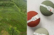
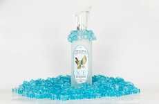
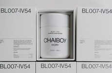
There is a bit of a design dilemma involved when marketing an Eastern product for a Western consumer base, so it's compelling to see just how Aura Health & Wellbeing packaging took on the task. Considering the selection of clean yet colorful bottles and boxes, one may not immediately be able to decide if they look more British or more Chinese.
A crisp white minimalism defines the base of the branding's aesthetic, but the few details added are distinctly Asian in appearance. The logo is a tripartite tea leaf abstraction, repeated in the intricate folding of the cardboard parcels. There is a subtle organic quality to the simple execution of the Aura Health & Wellbeing packaging that makes each cosmetic and nutritional item look pure and natural.
A crisp white minimalism defines the base of the branding's aesthetic, but the few details added are distinctly Asian in appearance. The logo is a tripartite tea leaf abstraction, repeated in the intricate folding of the cardboard parcels. There is a subtle organic quality to the simple execution of the Aura Health & Wellbeing packaging that makes each cosmetic and nutritional item look pure and natural.
Trend Themes
1. Cross-cultural Packaging - Opportunity for packaging designs that successfully bridge Eastern and Western aesthetics for global markets.
2. Minimalistic Branding - Opportunity for clean and simple branding designs that convey a sense of purity and naturalness.
3. Innovative Folding Techniques - Opportunity to explore creative and intricate folding techniques in packaging design to enhance visual appeal.
Industry Implications
1. Cosmetics - Innovative packaging designs in cosmetics industry that cater to diverse cultural preferences and aesthetics.
2. Health and Wellness - Opportunity for clean and natural branding in the health and wellness industry to attract conscious consumers.
3. Food and Beverage - Creative packaging designs for food and beverage products that successfully blend traditional and modern visual elements.
3.2
Score
Popularity
Activity
Freshness