


Alboredes Olive Oil Packaging References the Land that Bore it
Amelia Roblin — September 2, 2011 — Lifestyle
References: bozat & lovelypackage
There have been phases of recent history when organic branding has not been in style and products that appear as Alboredes Olive Oil packaging does might have been completely overlooked by consumers. It is difficult to imagine now, since it's so refreshing to have stepped away from the popular aesthetic of overly abstract graphic design.
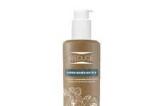
Ignasi Boza strove to intervene as little as possible with the natural details of the labeling. Clean white stickers were chosen to accent ebony-hued flasks and minimal text was printed onto them. Where the appearance of these products really pops is in the textured typography and the matching bottleneck decals. Alboredes Olive Oil packaging uses the organic origins of the pressed liquid to accent its image, in the form of soil, rocks and tree bark.
Ignasi Boza strove to intervene as little as possible with the natural details of the labeling. Clean white stickers were chosen to accent ebony-hued flasks and minimal text was printed onto them. Where the appearance of these products really pops is in the textured typography and the matching bottleneck decals. Alboredes Olive Oil packaging uses the organic origins of the pressed liquid to accent its image, in the form of soil, rocks and tree bark.
Trend Themes
1. Organic Branding - Opportunity for businesses to embrace organic branding to stand out from overly abstract graphic design.
2. Minimalistic Packaging - Increasing demand for clean and minimalistic packaging designs that allow natural product details to shine.
3. Textured Typography - Growing trend of using textured typography and matching decals to enhance product packaging.
Industry Implications
1. Food and Beverage - Food and beverage industry can explore organic branding to create unique packaging for their products.
2. Design and Branding - Design and branding industry can capitalize on the demand for minimalistic packaging and textured typography in product design.
3. Agriculture and Farming - Agriculture and farming industry can utilize the natural origins of their products to highlight their branding and packaging.
3.5
Score
Popularity
Activity
Freshness