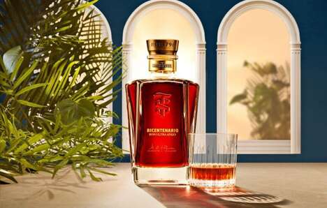
The redesign of Zacapa Rum's premium XO expression marks a significant evolution in the brand's visual identity.
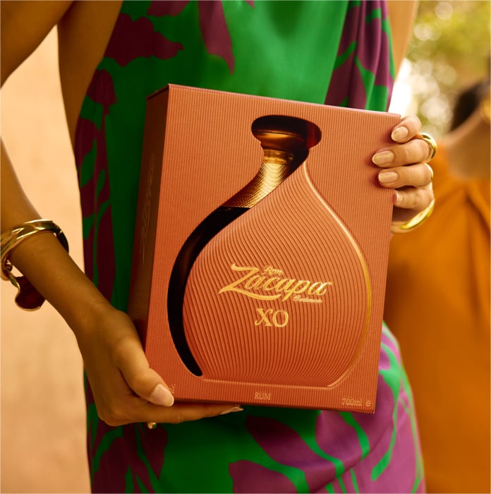
The new Zacapa Rum XO packaging signifies a deliberate shift from conventional luxury aesthetics. The design replaces traditional black and gold motifs with vibrant earth tones that draw inspiration from Guatemala's highland landscape — the site where the rum ages 2,300 meters above sea level. Intricate textural details and curved silhouettes frame the signature decanter, now enhanced by a golden interior that illuminates the amber-hued spirit. Thus, the packaging's aesthetic approach creates a dramatic presentation that honors both the product's artisan origins and contemporary design sensibilities.
While the exterior undergoes this transformation, the rum itself remains unchanged — a meticulously crafted blend of first-press sugarcane honey aged for at least ten years in former Cognac casks.
Image Credit: Zacapa Rum
What Makes This Trend Stand Out
- Sustainable Luxury Packaging
- The shift towards earth-toned designs showcases a growing trend in sustainable packaging that embraces natural aesthetics.
- Cultural Inspiration in Design
- Drawing inspiration from Guatemala's highland landscape reflects a broader trend of integrating cultural elements into product design.
- Modern Artisan Aesthetics
- The fusion of contemporary design with traditional craftsmanship speaks to an emerging trend in artisan-led luxury aesthetics.
Sectors Adopting This
- Luxury Goods
- The rum's packaging redesign highlights opportunities in the luxury sector to innovate beyond traditional opulence to attract modern consumers.
- Beverage Industry
- This updated packaging approach signals a shift within the beverage industry towards incorporating storytelling elements through design.
- Sustainable Packaging Industry
- Zacapa Rum's choice of earth tones and textures aligns with the growing sustainable packaging industry focused on eco-friendly and culturally relevant solutions.