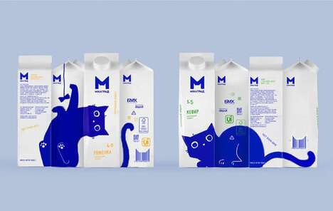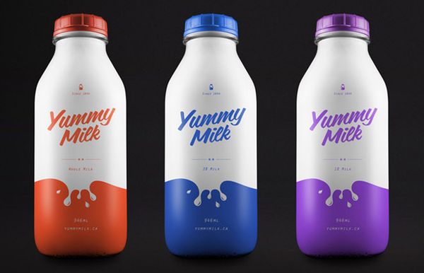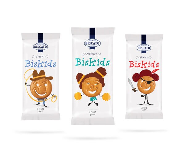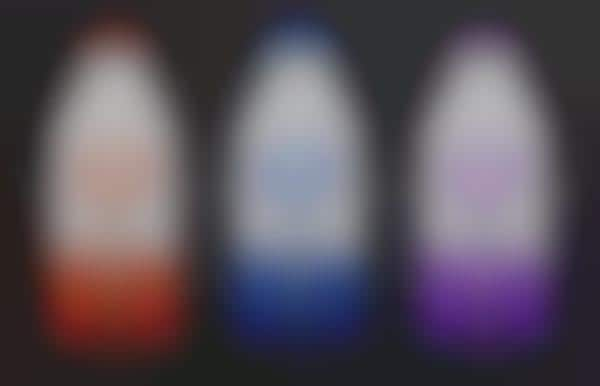
It would have been so easy for Yummy Milk packaging to be as bland as most other competing brand identities, but designer Simon Spring of Toronto successfully infused this line of dairy drinks with some flavor for the eyes. A splash of color was added to each and every product in the line as a way to foster visual intrigue and to distinguish between the various types of the beverage.
It looks as though the milk bottles were originally coated in bright purple, blue, orange or green, but that the creamy white drink was then spilled down the sides of every one, producing droplets on the front. Yummy Milk packaging is utterly delectable with its nostalgic container and its fresh graphic image.
What's Driving This Trend
- Colorful Packaging
- Companies can explore the use of vibrant colors in their product packaging to create visual intrigue and differentiate their brand from competitors.
- Visual Flavor Infusion
- By incorporating visually appealing elements into their product designs, businesses can enhance consumer interest and create a more unique and memorable brand experience.
- Nostalgic Packaging
- Brands can consider using retro-inspired packaging designs to evoke a sense of nostalgia and create a connection with consumers.
Who This Affects Most
- Food and Beverage
- Food and beverage companies can leverage colorful packaging and visual flavor infusion to create eye-catching and distinct products that appeal to consumers.
- Packaging
- In the packaging industry, there is an opportunity to innovate and develop new techniques and materials that allow for visually engaging designs like the Yummy Milk packaging.
- Graphic Design
- Graphic design professionals can explore the use of color splatter effects to create visually dynamic and interesting product branding, as demonstrated by Yummy Milk packaging.