There's something both devilish and divine about this famed toxic liqueur, and Vie70 Absinthe packaging puts this paradoxical image front and center. Eunice Yip, a student at the Royal Melbourne Institute of Technology, has developed this elegantly elongated bottle to contain the controversial beverage, embodying an irresistible red of passion and poison.
A fragmented silver typeface was chosen to mark the brand name, and capital sans serif text extends vertically to elaborate on the details of the product. The vessel itself has a sensual frosting, a black corked lid and a dark ribbon around the neck, garnished with a ruby rose.
Expressing an intoxicating aesthetic, the hallucinogenic alcohol variety puts on quite the savory seduction. Vie70 Absinthe packaging makes the potential drinker all the more likely to give into indulgence.
Key Themes Behind This Trend
- Intoxicating Aesthetics
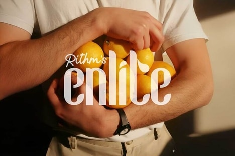
- Disruptive innovation opportunity: Develop innovative and visually appealing packaging designs for alcoholic beverages to enhance consumer allure and encourage indulgence.
- Fragmented Typography
- Disruptive innovation opportunity: Explore the use of fragmented typography in brand names and product details to create a unique and eye-catching visual identity for consumer products.
- Romantic Poison
- Disruptive innovation opportunity: Combine contradictory elements, such as passion and poison, to create intriguing and captivating brand stories that resonate with consumers.
Where This Applies
- Alcoholic Beverages
- Disruptive innovation opportunity: Look for ways to reinvent packaging and branding strategies for alcoholic beverages to captivate consumers and differentiate from competitors.
- Graphic Design
- Disruptive innovation opportunity: Embrace fragmented typography and bold visual elements in graphic design to create unconventional and attention-grabbing designs for various industries.
- Consumer Goods
- Disruptive innovation opportunity: Embrace immersive and intriguing brand storytelling to create emotional connections with consumers and differentiate products in the consumer goods industry.