The concept of branding relates to the image that a company or product impresses on clients or consumers, but 'Urban by Levi's' packaging takes the notion a little more literally.
Through the Academy of Art University of San Francisco, student Harshyla Singh was given the task of developing a line of hygiene products for an existing enterprise. Having settled on the denim-based clothier, the designer seems to have embraced inspiration from its blue jeans' leather tags.
The flat face of each of the bath and body product containers takes on the look of a branding iron steel stamp, expressing thickset typefaces, minimal text and embossed lettering. 'Urban by Levi's' labels may not have been cast in the proper backward orientation, but they have been accented with shiny silver ink.
What Makes This Trend Stand Out
- Branded Packaging
- 'Urban by Levi's' packaging takes a literal approach to branding with their stamp-like design.
- Minimalistic Design
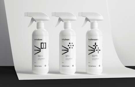
- The hygiene products' packaging expresses thickset typefaces, minimal text, and embossed lettering.
- Sustainable Packaging
- Using materials such as recycled or biodegradable material for packaging could complement this product's stylish and eco-friendly image.
Sectors Adopting This
- Fashion and Apparel Industry
- Other fashion and apparel businesses could adopt similar packaging designs to create a lasting impression on consumers.
- Personal Care and Hygiene Industry
- Product packaging with minimalist designs could provide a fresh and visually appealing take on personal care branding.
- Sustainable Packaging Industry
- Creating stylish and eco-friendly packaging for hygiene products could appeal to environmentally conscious consumers.