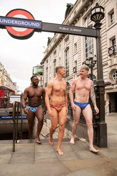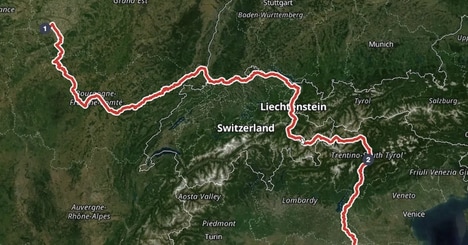

This subway-style Tour de France map is set up to look like the iconic signs used for the London Underground system. Even though the cyclists get to see a lot of lush landscapes when they cover huge distances during the races, most people would probably prefer getting around by tube, even though this means sacrificing a nice view. However, as much as you think that public transit might get you to a destination faster, over the course of the 2014 Tour de France, the competing cyclists will ride over 2,276 miles in incredible spans of time.
This fun map of the route shows the start and end points, with all of the curves and twists in between—but since the map is flattened and scaled down, we really don't get a great sense of the distance or any of the hills that require furious pedaling.
What Makes This Trend Stand Out
- Subway-style Maps for Sports Events
- Opportunity to create custom subway-style maps for other popular sports events like marathons and triathlons.
- Fusing Infographics and Transportation Maps
- Opportunity to create visually appealing infographics for data analysis and representation formatted as transportation maps.
- Tourism Maps for Cyclists
- Opportunity to create similar maps for tourists interested in exploring cities on bikes instead of public transport.
Sectors Adopting This
- Sports
- Sports event organizers can use subway-style maps to enhance the experience and engagement among fans and riders.
- Data Visualization
- Designers and data analysts can leverage transportation map formats for data visualization and provide new perspectives on data interpretation.
- Travel and Tourism
- Tourism industry can provide custom maps for bike tours or rentals, making it easier for tourists to navigate and explore cities on bikes.