The Rolling Stones 50th Anniversary Logo is Dynamic
Courtney Scharf — July 1, 2012 — Pop Culture
References: obeygiant & designtaxi
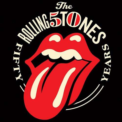
Marking the band's half-decade and unforgettable time together, the Rolling Stones 50th Anniversary logo is an embellished version of the original.
Created by American illustrator Shepard Fairey, this altered iconic sign now features a black background with a circular logo that shows band's name and a cleverly integrated inclusion of the number '50.' Using the original colors, slightly brightened and with more contrast, this is an appropriate revamp that avoids being too over the top. An updated, yet still nostalgic appropriation of the original, this was a risky move on the part of Fairey that paid off in a big way.
Celebratory, attractive and sharp, this design is the perfect example of a well executed mash-up of old and new, and will hopefully please even the biggest fans of the legendary rock band.
Trend Themes
-
Revamped Logos — The Rolling Stones 50th Anniversary logo showcases the potential for revitalizing iconic logos with modern updates.
-
Nostalgic Appropriations — The success of the revamped Rolling Stones logo demonstrates the market for updated designs that still maintain a sense of nostalgia.
-
Mash-up of Old and New — The Rolling Stones 50th Anniversary logo exemplifies the trend of combining classic elements with modern design for a fresh and appealing aesthetic.
Industry Implications
-
Music Merchandise — The Rolling Stones logo revamp presents an opportunity for music merchandise companies to create new products and generate excitement among fans.
-
Graphic Design — The success of Shepard Fairey's alteration of the Rolling Stones logo highlights the demand for skilled graphic designers who can update iconic visuals while maintaining their essence.
-
Brand Identity Consulting — The Rolling Stones 50th Anniversary logo showcases the need for brand identity consultants who can help businesses refresh their logos while preserving brand recognition.
2
Score
Popularity
Activity
Freshness
