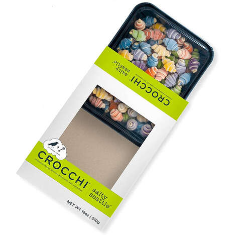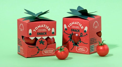
The way in which a company chooses to brand and market its product can make or brake its sales and the packaging for Ravioli 'Uralskaya Metelitsa' is a suitable example of what companies should do. The packaging for this Russian food brand, depicts a variety of scenarios and situations during which different characters are enjoying the product. Part of the packaging for Ravioli 'Uralskaya Metelitsa' uses a translucent material that is meant both as part of the design of the picture and to showcase the product itself.
The packaging depicts the pasta as part of the ocean, a river, a cup of steaming tea, an instrument and as a bowl of soup. The colors are vibrant and the faces of the characters smiling and happy.
Implications - Consumers are easily drawn to products with which they feel at ease or a sense of familiarity. Businesses that are able to create products with which consumers can create a personal relation will benefit tremendously.
What's Driving This Trend
- Personification Packaging
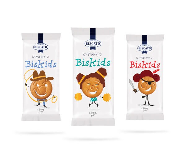
- Brands that use personification in their packaging can create a personal relationship with their consumers.
- Translucent Packaging
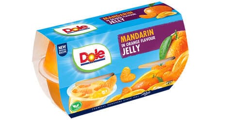
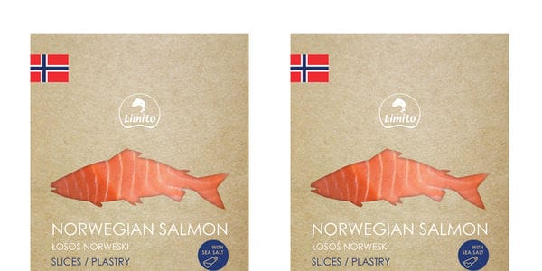
- Using translucent materials in packaging design can be used to showcase the product while also being a part of the design.
- Vibrant Packaging
- Bright and happy packaging with vibrant colors can draw consumers towards a product.
Who This Affects Most
- Food and Beverage
- The food and beverage industry can benefit from using personification, translucency and vibrant colors in their packaging design to connect with their consumers at a personal level.
- Consumer Goods
- Consumer goods companies can incorporate personification and vibrant colors in their packaging design to create a sense of familiarity and draw in consumers.
- Packaging Industry
- Using translucent materials and vibrant colors in packaging design can be an innovative opportunity for the packaging industry to provide appealing and creative packaging solutions to their clients.