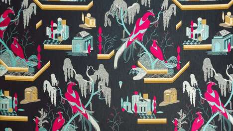
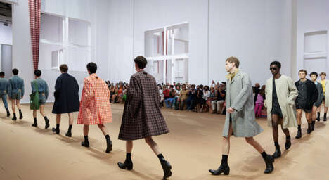
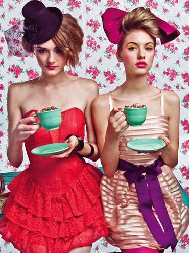
Combining different mediums always creates a more craftful art piece. The interesting combination between the graphic arts and photography in the Prada Spring/Summer 2010 lookbook sets the perfect example.
Although the pieces themselves may not be that extraordinary, the vivid colours, offset angles and varied incorporation of colours and backgrounds make these prints very artistically appealing.
Despite the saying that books shouldn’t be judged by their covers, this lookbook definitely makes the Prada collection appear more shop-worthy.
What's Driving This Trend
- Graphic Artography
- Combining different mediums in graphic arts and photography for artistic appeal.
- Vivid Color Convergence
- Incorporating varied colors and backgrounds for increased visual interest.
- Offset Angle Incorporation
- Using offsets in angles for a more craftful art piece.
Who This Affects Most
- Fashion
- Apparel industry can use graphic artography to create more visually appealing lookbooks.
- Photography
- Incorporating graphic arts in photography techniques can create new, unique styles.
- Marketing
- Incorporating graphic artistry in promoting a product can increase consumer interest.