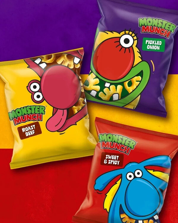
Monster Munch is a refreshed British snack identity developed by PepsiCo’s European design team with an evolved wordmark, updated product photography, revised color palette, and newly drawn monster characters. The redesign retains the recognizable creatures while refining their illustrations and placing greater emphasis on the snack itself. The color system draws from the product and its flavors, while updated photography gives the unusually shaped corn pieces greater prominence on packaging. The identity follows decades of visual changes dating back to the snack’s introduction in Britain in 1977.
The refreshed system maintains the character-led approach that has defined Monster Munch through successive redesigns. Earlier iterations moved the monsters toward computer-rendered forms before a 2008 revival returned to flatter, more expressive illustrations and packaging inspired by the 1980s identity. A 2019 redesign subsequently aligned the snack more closely with Walkers’ wider portfolio. The latest update retains the monsters as central graphic elements while refining the wordmark, imagery, and color system around Monster Munch’s individual visual identity.
Image Credit: PepsiCo
Part of the cluster
Heritage Refresh
CPG brands update visual systems and familiar cues with contemporary design
Explore the cluster
What's Driving This Trend
- Retro Character Branding
- Nostalgic mascots with modernized illustration styles create room for heritage brands to refresh emotional recognition without sacrificing contemporary shelf appeal.
- Snack-forward Packaging
- Greater emphasis on product photography and texture highlights the sensory qualities of unconventional snack formats, supporting differentiation in crowded retail environments.
- Flavor-led Color Systems
- Packaging palettes derived from individual flavors provide a scalable identity structure that balances portfolio consistency with stronger variant recognition.
Who This Affects Most
- Packaged Snacks
- Legacy snack brands are using refreshed visual identities to strengthen cultural relevance while preserving familiar assets that drive consumer loyalty.
- Brand Design
- Character-led redesigns reveal opportunities for design studios to modernize long-running identities through refined typography, illustration, and modular packaging systems.
- Food Retail
- More visually distinct snack packaging enhances shelf navigation and impulse appeal, reshaping how retailers merchandise nostalgic and family-oriented products.