The Lovely Honey Pot Design is Simple Yet Chic
References: jamienashillustration.blogspot & lovelypackage
The Lovely Honey packaging designed by London-based graphic designer Jamie Nash is simple and wonderfully basic.
The packaging concept came from Lovely Honey’s ability to be completely natural while still boasting health benefits that most seek from man-made medicine. The cute image of the bee with heart wings draws a childlike aesthetic, and is totally adorable.
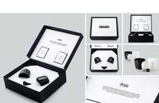
The Lovely Honey packaging includes a unique carrier box that is even more simple than the jar itself. With the heart-shaped wings as the focal point, the box is easily associated with the honey pot. The white, yellow and black color palette accented with the pink of the heart makes this package elegantly simple.
When up against other brands of honey, the Lovely Honey packaging is sure to attract a consumer’s eye.
Trend Themes
1. Minimalist Packaging Design - Utilizing simple and basic design elements in packaging to create an elegant and trendy aesthetic.
2. Childlike Aesthetics - Incorporating cute and playful elements in product design to appeal to consumers with a nostalgic sense of whimsy.
3. Natural Health Products - Addressing the growing demand for natural health products that provide similar benefits to man-made medicine.
Industry Implications
1. Food Packaging - Exploring innovative packaging designs for food products, utilizing minimalistic and visually appealing concepts.
2. Graphic Design - Using childlike aesthetics and simple design elements to create visually engaging graphics for various industries.
3. Health and Wellness - Developing natural health products that combine the benefits of traditional medicine with appealing packaging and branding.
4
Score
Popularity
Activity
Freshness

