This Krc&Ko Branded Merchandise is Aesthetically Appeasing
References: petergregson & lovelypackage
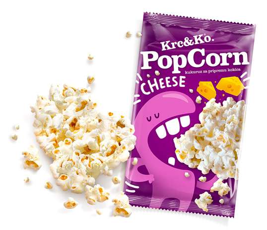
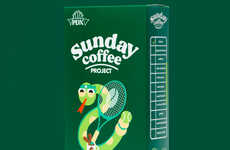
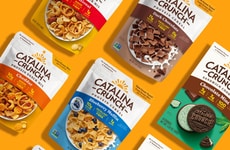
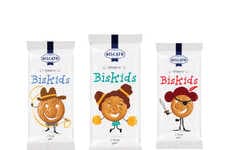
Krc&Ko. (or rather, Crunch&Co. in English) has come up with brightly colored packaging to help sell their delectable snacks.
The company relied heavily on using cute characters to help sell their products. Each different snack has a different character representing the treat. Krc&Ko. color-coordinated their characters to the flavor. An example of this is the Pikantni flavor, which uses red on their packaging as red is associated with heat. Additionally, the packaging for the product included baby-friendly designs for the infant cookies as well as comedic chocoholic characters for the digestive segment of the Krc&Ko. snacks.
The packaging was designed by Peter Gregson. According to him the design choices represent "[...] the character that enjoys eating various snacks as illustrated on the package."
Trend Themes
1. Childlike Packaging - More companies can explore the use of cute and colorful packaging to create a visually appealing experience for consumers.
2. Character Branding - Using mascots and characters to represent different products and flavors can create a recognizable and distinct brand image.
3. Product Personalization - Customizing packaging to coordinate with different flavors or customer preferences can create a unique and memorable experience for consumers.
Industry Implications
1. Food and Beverage Industry - Food and beverage brands can create a more enjoyable experience for consumers by innovating their packaging and branding tactics.
2. Marketing and Advertising Industry - Marketing and advertising agencies can partner with companies to enhance their brand image by using playful characters and personalized packaging.
3. E-commerce Industry - Online retailers can use innovative packaging and branding strategies to differentiate themselves from competitors and create a more memorable customer experience.
1.6
Score
Popularity
Activity
Freshness
